• Home
  • About
  • Disclosure
  • FAQ
  • Contact Me
jadanchik.comjadanchik.com
  • Home
  • About
  • Disclosure
  • FAQ
  • Contact Me

Saturday Stamping with Jo Ann: Under the Sea

Saturday Stamping with Jo Ann: Under the Sea

Saturday Stamping with Jo Ann: Under the Sea

December 30, 2017 Posted by Jo Ann Danchik Alcohol Inks, Backgrounds, Distress Inks, Project, Scene Building, Stencils, Techniques, Wall Art, Watercolor

This post was originally seen on the Honey Bee Stamp Blog on 9/16/17. It is being added to my personal blog so that it can be archived. Enjoy!

……….

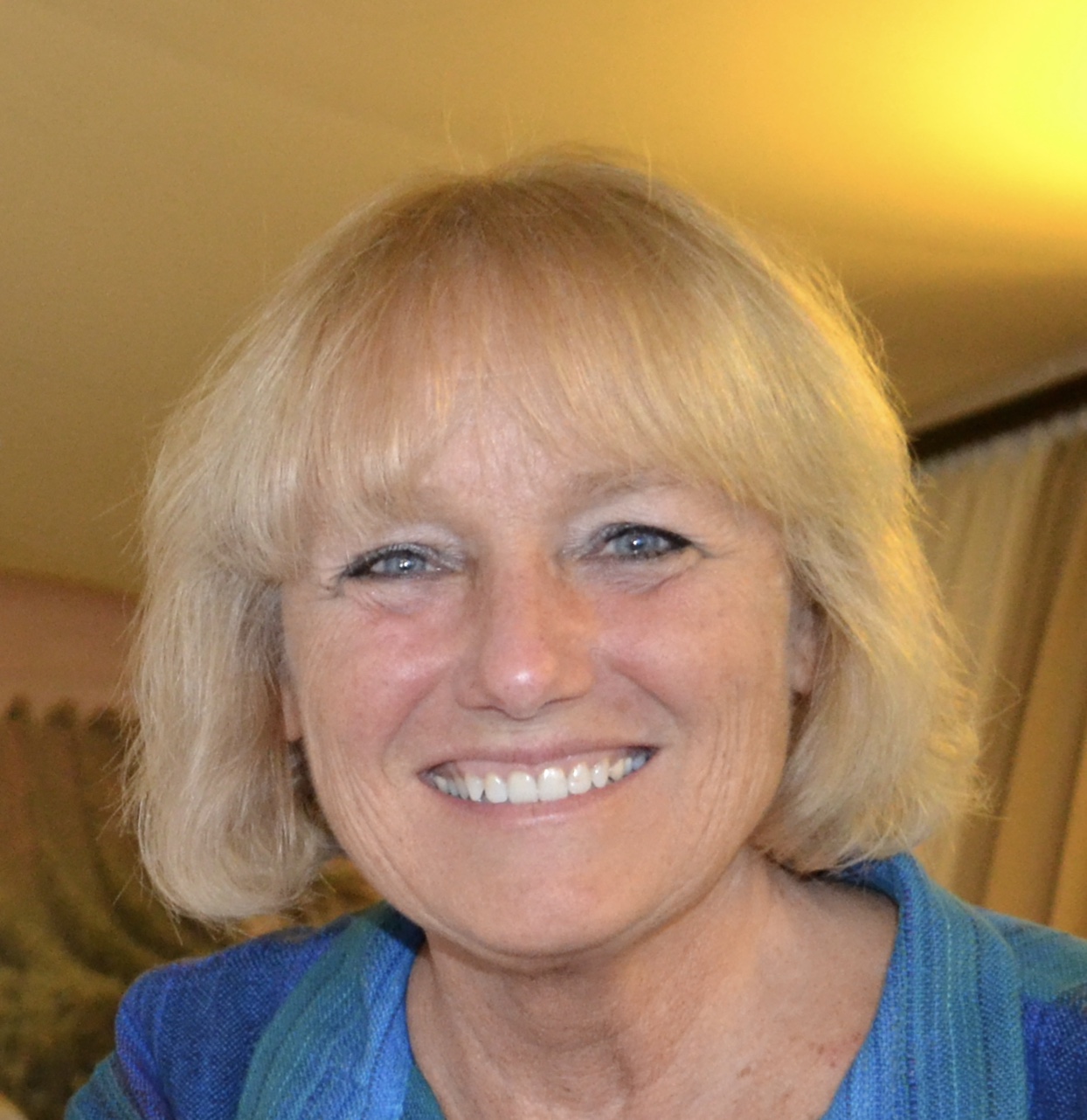
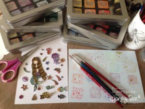
Hi…my name is Jo Ann Danchik and I am thrilled and honored to be a guest today on the Honeybee Stamp blog! I have had a lot of fun playing with the many stamps, dies, and stencils from the “Under The Sea” July release.

……….

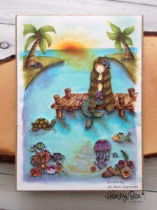
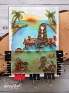
Today’s project started with the Ocean Bliss mermaid. I traced the inside of the coordinating die onto a thin piece of copy paper. I knew that I wanted to put the mermaid on a dock, so I drew one around her. Drawing is not a skill set that I have been blessed with but I have been branching out lately and trying my hand at small bits and pieces to add to whatever scene I am creating. A dock really only involves some simple straight lines. Given enough time…and an ample eraser…anybody can do it! 🙂

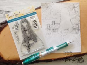
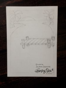
As my idea evolved I came to the realization that a regular card front would be a tight fit. Using a light box, I traced my initial sketch onto a 6 1/2” x 8 3/4” piece of Ranger watercolor paper.

I stamped the Mermaid from the Ocean Bliss set, the turtle from the Swimming By set, and various shells, fish, and coral from the Message In A Bottle and the Zen Ocean sets. All the images were watercolored using Tim Holtz’s Distress Inks. I’m not a fan of fussy cutting, that’s why I buy the coordinating dies, but I knew that I would have to hand cut the pieces from the Zen Ocean image. I wanted all the pieces to match so I fussy cut everything to avoid the white outlines.

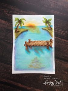
Using the same inks, I watercolored the background scene. I added sun rays and a reflection in the water using a sponge dauber and the Narrow Light Rays and Water Light Reflection stencils from the Ocean Scene Builder stencil set. A larger reflection was added, at the bottom of the scene, using the same stencil. With the Cloud Borders dies, I cut several different edges into a piece of heavy cardstock. Using different parts of these edges, and another sponge dauber, I created a sky with puffy clouds.

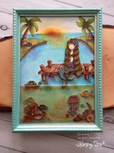
After glueing the background to a large Tim Holtz Idea-ology Framed Panel, I added the Mermaid, turtle, shells, fish, and coral with liquid adhesive. Some pieces were given dimension with foam tape. I added cast shadows around them with my watercolors.

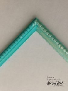
Next, I painted the outside frame with Caribbean Seas chalk acrylic paint from Paper Artsy (left). When it dried, I added a layer of ‘Mother of Pearl’ Nuvo Embellishments Mousse for a beautiful sheen (right).

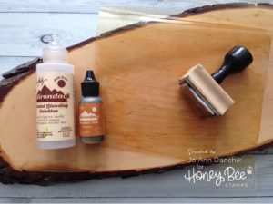
I was wracking my brain for a way to give everything an underwater look…without a lot of extra painting and shading! I remembered a technique that I had used on an earlier piece to age a glass bottle. Using a piece of thin plastic packaging, from a stamp set, I cut off the top and bottom and slit open one long side. With an applicator tool, and Tim Holtz’s ‘Caramel’ Alcohol Ink, I lightly sponged color on half of the plastic. If it gets too dark you can remove some color with Blending Solution. The blending solution also helps to create streaks and bubbles.

I glued the plastic edges shut on three sides, trapping the ink inside. With the fold at the top, the sides and bottom were glued to the background using Ranger’s Glossy Accents. I used clamps to keep it taut while the glue dried.

To finish the piece, the frame was added with more Glossy Accents and set aside to dry.

Thank you for sharing your time with me.
Joyfully,  Jo Ann

SaveSave

SaveSave

SaveSave

SaveSave

SaveSave

SaveSave

SaveSave

3
Share

You also might be interested in

Honey Bee Sneak Peek Day Three: Life Is Sweeter

Honey Bee Sneak Peek Day Three: Life Is Sweeter

Jul 31, 2018

This is Day Three of the BEE BOLD Summer Release[...]

Creative Sundays With Jo Ann: Scalloped Heart Valentine

Creative Sundays With Jo Ann: Scalloped Heart Valentine

Feb 3, 2019

I am always looking for something fast and easy to[...]

Midweek Creations With Jo Ann: Woodland Deer Ornament

Midweek Creations With Jo Ann: Woodland Deer Ornament

Nov 28, 2018

I love the Stag, with his magnificent antlers, and the[...]

Hello......I'm Jo Ann

Christian, wife, and proud mother and grandma. I love to create art, cook, read a good book, take photos, and travel. -Enjoy life now...this is not a rehearsal!

....

While this blog is my personal journey I hope that you find something here that encourages you to unfurl your wings and be creative. Most everybody has a little childlike creativity in them just waiting to be set free. It doesn't have to be perfect... just create.

....

…………………………………………..

Enter your email address below to subscribe to this blog. You will receive notifications of new posts by email.


* indicates required


*Check your email to confirm subscription.

…………………………………………..

Categories

  • Action Card
  • Alcohol Inks
  • Altered Art
  • Backgrounds
  • Banners
  • Birthday
  • Bookmark
  • Cards
  • Chalk
  • Christmas
  • Colored Pencils
  • Congratulations
  • Copics
  • Distress Inks
  • Distress Oxide Inks
  • Easter
  • Embossing
  • Embossing Paste
  • Encouragement Cards
  • Fall
  • Father's Day
  • Foiling
  • Friend
  • General
  • Get Well
  • Gift Card Holder
  • Gift Tags
  • Graduation
  • Halloween
  • Hello
  • Holiday
  • Holiday Decor
  • Home Decor
  • Ink Blending
  • Interactive
  • Love
  • Markers
  • Masking
  • Miss You
  • Mother's Day
  • New Years
  • No Line Coloring
  • One Layer Cards
  • Ornaments
  • Patriotic
  • Placemats
  • Project
  • Scene Building
  • Shadow Box Cards
  • Shaker Cards
  • Shape Cards
  • Shared Thoughts
  • Shrinky Dinks
  • St. Patrick's Day
  • Stencils
  • Sympathy
  • Tags
  • Techniques
  • Texture Paste
  • Thank You
  • Tools
  • Uncategorized
  • Valentines
  • Wall Art
  • Watercolor
  • Wedding / Anniversary
  • Wreath Builder

Archives

  • June 2019
  • May 2019
  • April 2019
  • March 2019
  • February 2019
  • January 2019
  • December 2018
  • November 2018
  • October 2018
  • September 2018
  • August 2018
  • July 2018
  • June 2018
  • May 2018
  • April 2018
  • March 2018
  • February 2018
  • January 2018
  • December 2017

Recent Posts

  • Midweek Creations With Jo Ann: Floral Cross Background
  • Creative Sundays With Jo Ann: Goodbyes Are Not Forever
  • Midweek Creations With Jo Ann: Tropical Rainforest Shaker Card
  • National Honey Bee Day Blog Hop: You’re The Bee’s Knees
  • Creative Sundays With Jo Ann: Mandala Love

Tags

Angel Policy Stamp Set and Dies Backgrounds Bill The Bear Stamp Set and Dies Birthday Cardmaking Cards Christmas Cloud Border Die Set Colored Pencils Copics Design Team Die Cutting Dies Distress Inks Distress Oxide Inks Encouragement Feelin' Foxy Stamp Set and Dies Friend General Hand Drawing Heat Embossing Holiday Honey Bee Stamps Ink Blending Love Mae The Mouse Stamp Set and Dies Markers Masking Misti Tool New Release One Layer Cards Papercrafting Penny The Platypus Stamp Set and Dies Pinky The Pig Stamp and Die Set Projects Scene Building Snow Buddies Stamp Set and Dies Stamping Stamps Techniques Tools Trinity Stamps Tutorial Valentines Watercolor

Instagram Feed

jadanchik

A study in two different mediums… Tim Holtz WC D A study in two different mediums…
Tim Holtz WC Distress Pencils -v- Windsor & Newton Cotman WC Paints. 👩‍🎨🎨
—————
1. On the right is my original painting using W & N paints. I mixed equal parts Intense Blue and Cadmium Red Pale Hue to make black. I added additional water and thinned down washes to the bird to make the blooms and drips. As the paint thins out it creates lovely bluish tints.
2. On the left I used Tim’s WC Pencils. Distress Black Soot Ink has the unique property of maintaining its true black color as it’s thinned with water. The pencils do as well. Hmmm 🤔 To remedy this I quickly made a thin wash with Prize Ribbon while the painting was still wet. I alternated adding thinned blobs of the black and blue wash until I got the desired results.
—————
The more I study it…the more I prefer the raven on the left! Do you have a favorite?
—————
@tim_holtz @ranger_ink #timholtz #distress #distressinks #distresspencils
When you still have your new pencils out…but hav When you still have your new pencils out…but have no idea what to do with yourself. Cleaning your mess is not the answer. 😜 Then out of the corner of your eye you see Tim’s new “Unraveled” stamp set from Stamper’s Anonymous and some leftover scraps of watercolor paper. You just start to paint. Not sure what it will become when I fussy cut it. Mum(my)’s the word! 🤫
—————
(Swipe left for process pics)
1. Stamped with Antique Linen Distress ink for no line painting.
2. Antique Linen says it all. It’s in the name! But it was too dark so I made a wash and added some Picket Fence to lighten it. The brown is a mix of Walnut Stain and Black Soot.
—————
@tim_holtz @stampersanonymous @ranger_ink #timholtz #stampersanonymous #distress #distressinks #distresspencils
Still testing out the new Tim Holtz Distress Penci Still testing out the new Tim Holtz Distress Pencils. And how much fun is Tim’s new “The Scarecrow” stamp set from Stamper’s Anonymous? 🧡
—————
(Swipe right for process pics)
1. I stamped the scene using Antique Linen Distress Ink for no line painting with the watercolor pencils.
2. I realized that I put the sun on the right but the shadows on the scarecrow are also on the right. 🤔 Simple fix. I wet the shadow lines and lifted them with a paper towel. The crow and the plaid shirt are my favorite parts!!
3. I wanted to create some color blends so I made some heavily pigmented washes.
4. I wasn’t sure how to add a background at this point without a lot of masking. I carefully flooded the paper with water, avoiding the painted areas, and floated in several different light color washes.
—————
@tim_holtz @stampersanonymous @ranger_ink #timholtz #stampersanonymous #distressink #distress #distresspencils
I know…I know…no posts for 2+ years and now he I know…I know…no posts for 2+ years and now here I am posting again! 😜 I would have made this a reel, but after an hour of trying to figure it out I gave up. 🫤
—————
After painting the cat, crow, and bats yesterday I immediately thought of Tim Holtz’s new “Gothic Tapestry” skull from Stamper’s Anonymous. And I wanted to play with my new Distress Pencils some more…of course I did!
—————
I stamped a partial picture using Hickory Smoke Oxide ink. The watercolor paper (140lb cold press) was very textured so the impression is sketchy at best, but I didn’t need a lot of details.
—————
I love it! (Hubby thinks that it looks like Chewbacca!! 😂) 

We are going to need open stock on the black pencil!! @ranger_ink @tim_holtz @stampersanonymous #timholtz #stampersanonymous #distress #distresspencils #watercolopencils
Part Two I tested several of my favorite watercolo Part Two
I tested several of my favorite watercolor pencil methods still using the Windsor & Newton professional cold press 140 lb watercolor paper. High quality paper is oftentimes more important than the quality of paint in getting good results.
1. The first swatch is pencil scribbled directly onto the paper and activated with a water brush. The Seedless Preserves is highly pigmented but a little harder to break down and dissolve. Darker reds and purples sometimes behave this way.
2. The second swatch is dipping the tip of the pencil in the water and smoothing with a wet brush. This delivers a large pigment load. You can also run a wet brush over the tip of the pencil  and then paint. These offer very smooth results.
3. The third swatch is a wash. I like to create a controlled wash. Yes…you can do this easily with pencils. Add a few drops of water to a porcelain well. Run your water brush over the tip of the pencil and swirl it into the water. Repeat multiple times until you get the paint to water ratio that you want. With a wash you can add many layers to your painting.
4. The top picture shows how well the colors lift. This is useful info for adding highlights and shading or if you accidentally drop color in an unwanted area. Being Distress Inks, they don’t appear to react quite the same to water droplets as regular Distress Inks. They do lift when dry, but some colors stain more than others.
(continued in comments)
timholtz @ranger_ink #timholtz #distress #distresspencils #watercolorpencils
Part One I have been watching for the UPS driver a Part One
I have been watching for the UPS driver all week. When my package of Distress Pencils arrived yesterday afternoon I nearly snatched it from their hands! 😂
I work a lot with different watercolor paints, pencils, and crayons so I was eager to play with them. I used Windsor & Newton professional cold press 140 lb watercolor paper to test them. It’s bumpy so you get a lot of white space when you scribble on the pigment.
1. As I tend to layer colors I immediately put them into color families. I know that you like to dig for them Tim but I need them in color order and don’t have your patience. You are a “hunter” and I am a “gatherer.” 😜
2. I swatched them out…not only to have a chart but to check on several properties. It shows me how easily the different colors dissolve on the paper but also how they “water down” into a wash near the bottom of the swatch. The black line shows their transparency. Most colors are highly pigmented, yet transparent, and easy to dissolve.
So far I am loving them!!! (More in next post.)
@tim_holtz @ranger_ink  #timholtz #distress #distresspencils #watercolorpencils
I have been doing a lot of watercoloring this summ I have been doing a lot of watercoloring this summer and thought that I might start posting again. (I haven’t shared my art work socially in over 2 years.) I painted these three Halloween Decoration Cards this morning using Windsor & Newton paints. They are from an older Michael’s class (free) taught by Mandy Peltier. They were a hoot to paint!
@mandypeltierartist @michaelsstores @winsorandnewton #winsorandnewton #makeitwithmichaels #michaelsclasses
Sometimes it is hard to step back, reevaluate, and Sometimes it is hard to step back, reevaluate, and admit that you need to see things differently!! These are powerful phrases that I intend to learn and to use gracefully.
—————
Thanks my friend for allowing me to share your wise words! ❤️@turnertr03
I am learning. I am listening. #blackouttuesday #a I am learning. I am listening.
#blackouttuesday #amplifymelanatedvoices
Load More... Follow on Instagram

Copyright Statement:

All content, including text, photos, and projects are the property of  Jo Ann Danchik. I encourage you to use this blog as inspiration for your personal projects. If you use any parts of this blog on another blog, website, or in any other public forum, please link back to this blog at jadanchik.com rather than copy and paste any of the information.


© [2017] · Jo Ann Danchik · All Rights Reserved.

Next