• Home
  • About
  • Disclosure
  • FAQ
  • Contact Me
jadanchik.comjadanchik.com
  • Home
  • About
  • Disclosure
  • FAQ
  • Contact Me

Midweek Creations With Jo Ann: Jump For Joy

Midweek Creations With Jo Ann: Jump For Joy

Midweek Creations With Jo Ann: Jump For Joy

May 15, 2019 Posted by Jo Ann Danchik Action Card, Cards, Copics, Encouragement Cards, Friend, General, Shaker Cards, Shape Cards, Techniques

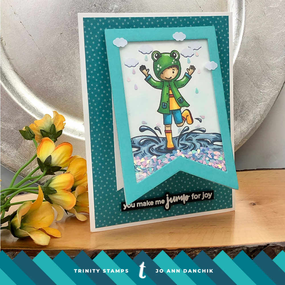
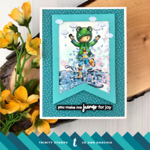
Watching this child gleefully splash in the puddles just makes me happy. The froggy rubber raincoat and Wellies (boots) brings back memories. I remember, as a child, playing in the rain on warm summer days. It was fun to jump in the puddles. As an adult, I seem to have lost that childlike innocence. I find the rain a nuisance if I am driving in it or have to run errands. Although, I do still enjoy sitting on my covered deck, watching an afternoon Texas thunderstorm. The smell of ozone and petrichor is intoxicating!
____________________

(Products highlighted in teal are active links to the shop.)

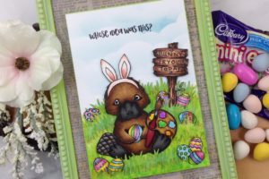
Today’s card features the adorable Puddle Jumpers Stamp Set. Let’s get started!

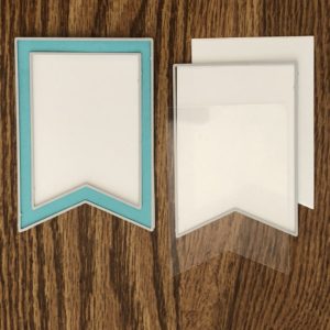
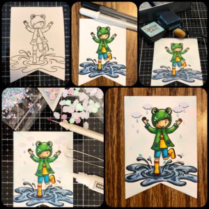
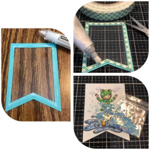
I wanted to do something a little different. I wanted to use a banner shape, make it into a shaker, and have it open on the front of the card. To start, I cut one large white banner. Using a smaller die, I paired it with the large die to make a frame from Hero Arts Mist cardstock. I used the die size that is slightly smaller than the larger one to cut two more shapes and a piece of Hero Arts Acetate. All the white cardstock is #80 Neenah Solar Crest.

The image was stamped with copic friendly Gina K Amalgam Ink onto one of the small banners. I colored with copic markers. Freckles on the frog, buttons on the pockets, and highlights were added with white and black Gelly Roll Pens. Freckles on the boy and spots on the frog were added with a 0.3 Brown Copic Multiliner.

I added a light layer of Tumbled Glass Distress Ink to the background with a Picket Fence Life Changing Brush. 

Trinity has the best embellishments! I chose the Puffy Cloud: Iridescent and Matte Cloud Confetti Mix and the Puddle Jumping: Iridescent Lt Blue Raindrop Confetti Mix to add some clouds and a few stationary raindrops to the background. When the shaker elements are at the bottom of the card you will still have some in the background.

To help the clouds stand out from the background I went around the bottoms with a 0.3 Copic Multiliner.

To create the shaker, I adhered the acetate to the back of the banner frame. Scotch Foam Tape was added to the back. Make sure that there are no gaps in the tape or your elements will fall out. Adding a little anti static powder along the tape edges helps to keep the sequins from sticking.

I added enough raindrops to the shaker to fill the bottom of the pennant and not cover up too much of the puddle. The frame was adhered to the panel.

You can see the copic coloring through the back of the panel so a backing needs to be added. But, before I did, I was trying to figure out how to make a cardstock hinge to add when I remembered that Jennifer McGuire made one from acetate. I searched through her site and found her tutorial. I have linked it here for those who are interested.

I cut two thin strips of acetate from a Hero Arts folded acetate card. These cards are a little thicker and sturdier. If you are using regular acetate you need to fold over an edge and crease it on each.

Strong 1/4 “Scor-Tape was added to each hinge and attached to the back of the shaker. The backing piece was then added to cover the copic coloring and the hinges.

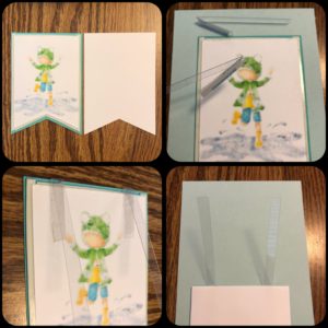
More score tape was added to the rest of the hinge. The last small banner was centered on the back of the shaker and the hinges were attached. 

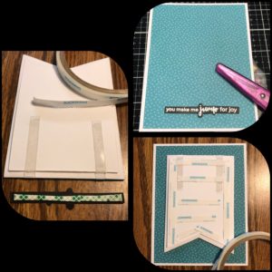
The sentiment is also from the Puddle Jumper Stamp Set. It was stamped with Versamark and heat embossed with Hero Arts White Embossing Powder. I fussy cut around the sentiment and added dimensional tape to the back.

Pattern paper was cut 4” x 5.25” and adhered to a single layer piece of #110 Neena Solar Crest with a tape runner. Additional Scor-Tape was added to the back of the shaker panel and adhered to the patterned panel.

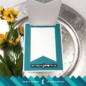
When you lift the banner panel there is plenty of room for a sentiment on the inside.

Additional cloud sequins were added to the front of the shaker along the edges of the frame.

This is such a fun and joyful card to send. It looks like the child is splashing raindrop sequins when the panel is lifted.

As always, thank you for joining me today.

Joyfully,
Jo Ann

Supplies used:
The products that I used are listed below in compensated affiliate links. You can click the icon of your choice, below the product picture, to go directly to your favorite shop. There is NO additional cost to you when using these links. Thank you for your support!


4
Share

You also might be interested in

Midweek Creations With Jo Ann: Am I Too Late

Midweek Creations With Jo Ann: Am I Too Late

Mar 20, 2019

I am a card maker. I love to make cards.[...]

Creative Sundays With Jo Ann: Whimsical Garden Placemat

Creative Sundays With Jo Ann: Whimsical Garden Placemat

Mar 18, 2018

We are a family who uses placemats, with matching cloth[...]

Honey Bee Stamps: Cheerful Love Blog Hop

Honey Bee Stamps: Cheerful Love Blog Hop

Feb 23, 2018

Today I am part of the Honey Bee Stamp Blog[...]

Hello......I'm Jo Ann

Christian, wife, and proud mother and grandma. I love to create art, cook, read a good book, take photos, and travel. -Enjoy life now...this is not a rehearsal!

....

While this blog is my personal journey I hope that you find something here that encourages you to unfurl your wings and be creative. Most everybody has a little childlike creativity in them just waiting to be set free. It doesn't have to be perfect... just create.

....

…………………………………………..

Enter your email address below to subscribe to this blog. You will receive notifications of new posts by email.


* indicates required


*Check your email to confirm subscription.

…………………………………………..

Categories

  • Action Card
  • Alcohol Inks
  • Altered Art
  • Backgrounds
  • Banners
  • Birthday
  • Bookmark
  • Cards
  • Chalk
  • Christmas
  • Colored Pencils
  • Congratulations
  • Copics
  • Distress Inks
  • Distress Oxide Inks
  • Easter
  • Embossing
  • Embossing Paste
  • Encouragement Cards
  • Fall
  • Father's Day
  • Foiling
  • Friend
  • General
  • Get Well
  • Gift Card Holder
  • Gift Tags
  • Graduation
  • Halloween
  • Hello
  • Holiday
  • Holiday Decor
  • Home Decor
  • Ink Blending
  • Interactive
  • Love
  • Markers
  • Masking
  • Miss You
  • Mother's Day
  • New Years
  • No Line Coloring
  • One Layer Cards
  • Ornaments
  • Patriotic
  • Placemats
  • Project
  • Scene Building
  • Shadow Box Cards
  • Shaker Cards
  • Shape Cards
  • Shared Thoughts
  • Shrinky Dinks
  • St. Patrick's Day
  • Stencils
  • Sympathy
  • Tags
  • Techniques
  • Texture Paste
  • Thank You
  • Tools
  • Uncategorized
  • Valentines
  • Wall Art
  • Watercolor
  • Wedding / Anniversary
  • Wreath Builder

Archives

  • June 2019
  • May 2019
  • April 2019
  • March 2019
  • February 2019
  • January 2019
  • December 2018
  • November 2018
  • October 2018
  • September 2018
  • August 2018
  • July 2018
  • June 2018
  • May 2018
  • April 2018
  • March 2018
  • February 2018
  • January 2018
  • December 2017

Recent Posts

  • Midweek Creations With Jo Ann: Floral Cross Background
  • Creative Sundays With Jo Ann: Goodbyes Are Not Forever
  • Midweek Creations With Jo Ann: Tropical Rainforest Shaker Card
  • National Honey Bee Day Blog Hop: You’re The Bee’s Knees
  • Creative Sundays With Jo Ann: Mandala Love

Tags

Angel Policy Stamp Set and Dies Backgrounds Bill The Bear Stamp Set and Dies Birthday Cardmaking Cards Christmas Cloud Border Die Set Colored Pencils Copics Design Team Die Cutting Dies Distress Inks Distress Oxide Inks Encouragement Feelin' Foxy Stamp Set and Dies Friend General Hand Drawing Heat Embossing Holiday Honey Bee Stamps Ink Blending Love Mae The Mouse Stamp Set and Dies Markers Masking Misti Tool New Release One Layer Cards Papercrafting Penny The Platypus Stamp Set and Dies Pinky The Pig Stamp and Die Set Projects Scene Building Snow Buddies Stamp Set and Dies Stamping Stamps Techniques Tools Trinity Stamps Tutorial Valentines Watercolor

Instagram Feed

jadanchik

A study in two different mediums… Tim Holtz WC D A study in two different mediums…
Tim Holtz WC Distress Pencils -v- Windsor & Newton Cotman WC Paints. 👩‍🎨🎨
—————
1. On the right is my original painting using W & N paints. I mixed equal parts Intense Blue and Cadmium Red Pale Hue to make black. I added additional water and thinned down washes to the bird to make the blooms and drips. As the paint thins out it creates lovely bluish tints.
2. On the left I used Tim’s WC Pencils. Distress Black Soot Ink has the unique property of maintaining its true black color as it’s thinned with water. The pencils do as well. Hmmm 🤔 To remedy this I quickly made a thin wash with Prize Ribbon while the painting was still wet. I alternated adding thinned blobs of the black and blue wash until I got the desired results.
—————
The more I study it…the more I prefer the raven on the left! Do you have a favorite?
—————
@tim_holtz @ranger_ink #timholtz #distress #distressinks #distresspencils
When you still have your new pencils out…but hav When you still have your new pencils out…but have no idea what to do with yourself. Cleaning your mess is not the answer. 😜 Then out of the corner of your eye you see Tim’s new “Unraveled” stamp set from Stamper’s Anonymous and some leftover scraps of watercolor paper. You just start to paint. Not sure what it will become when I fussy cut it. Mum(my)’s the word! 🤫
—————
(Swipe left for process pics)
1. Stamped with Antique Linen Distress ink for no line painting.
2. Antique Linen says it all. It’s in the name! But it was too dark so I made a wash and added some Picket Fence to lighten it. The brown is a mix of Walnut Stain and Black Soot.
—————
@tim_holtz @stampersanonymous @ranger_ink #timholtz #stampersanonymous #distress #distressinks #distresspencils
Still testing out the new Tim Holtz Distress Penci Still testing out the new Tim Holtz Distress Pencils. And how much fun is Tim’s new “The Scarecrow” stamp set from Stamper’s Anonymous? 🧡
—————
(Swipe right for process pics)
1. I stamped the scene using Antique Linen Distress Ink for no line painting with the watercolor pencils.
2. I realized that I put the sun on the right but the shadows on the scarecrow are also on the right. 🤔 Simple fix. I wet the shadow lines and lifted them with a paper towel. The crow and the plaid shirt are my favorite parts!!
3. I wanted to create some color blends so I made some heavily pigmented washes.
4. I wasn’t sure how to add a background at this point without a lot of masking. I carefully flooded the paper with water, avoiding the painted areas, and floated in several different light color washes.
—————
@tim_holtz @stampersanonymous @ranger_ink #timholtz #stampersanonymous #distressink #distress #distresspencils
I know…I know…no posts for 2+ years and now he I know…I know…no posts for 2+ years and now here I am posting again! 😜 I would have made this a reel, but after an hour of trying to figure it out I gave up. 🫤
—————
After painting the cat, crow, and bats yesterday I immediately thought of Tim Holtz’s new “Gothic Tapestry” skull from Stamper’s Anonymous. And I wanted to play with my new Distress Pencils some more…of course I did!
—————
I stamped a partial picture using Hickory Smoke Oxide ink. The watercolor paper (140lb cold press) was very textured so the impression is sketchy at best, but I didn’t need a lot of details.
—————
I love it! (Hubby thinks that it looks like Chewbacca!! 😂) 

We are going to need open stock on the black pencil!! @ranger_ink @tim_holtz @stampersanonymous #timholtz #stampersanonymous #distress #distresspencils #watercolopencils
Part Two I tested several of my favorite watercolo Part Two
I tested several of my favorite watercolor pencil methods still using the Windsor & Newton professional cold press 140 lb watercolor paper. High quality paper is oftentimes more important than the quality of paint in getting good results.
1. The first swatch is pencil scribbled directly onto the paper and activated with a water brush. The Seedless Preserves is highly pigmented but a little harder to break down and dissolve. Darker reds and purples sometimes behave this way.
2. The second swatch is dipping the tip of the pencil in the water and smoothing with a wet brush. This delivers a large pigment load. You can also run a wet brush over the tip of the pencil  and then paint. These offer very smooth results.
3. The third swatch is a wash. I like to create a controlled wash. Yes…you can do this easily with pencils. Add a few drops of water to a porcelain well. Run your water brush over the tip of the pencil and swirl it into the water. Repeat multiple times until you get the paint to water ratio that you want. With a wash you can add many layers to your painting.
4. The top picture shows how well the colors lift. This is useful info for adding highlights and shading or if you accidentally drop color in an unwanted area. Being Distress Inks, they don’t appear to react quite the same to water droplets as regular Distress Inks. They do lift when dry, but some colors stain more than others.
(continued in comments)
timholtz @ranger_ink #timholtz #distress #distresspencils #watercolorpencils
Part One I have been watching for the UPS driver a Part One
I have been watching for the UPS driver all week. When my package of Distress Pencils arrived yesterday afternoon I nearly snatched it from their hands! 😂
I work a lot with different watercolor paints, pencils, and crayons so I was eager to play with them. I used Windsor & Newton professional cold press 140 lb watercolor paper to test them. It’s bumpy so you get a lot of white space when you scribble on the pigment.
1. As I tend to layer colors I immediately put them into color families. I know that you like to dig for them Tim but I need them in color order and don’t have your patience. You are a “hunter” and I am a “gatherer.” 😜
2. I swatched them out…not only to have a chart but to check on several properties. It shows me how easily the different colors dissolve on the paper but also how they “water down” into a wash near the bottom of the swatch. The black line shows their transparency. Most colors are highly pigmented, yet transparent, and easy to dissolve.
So far I am loving them!!! (More in next post.)
@tim_holtz @ranger_ink  #timholtz #distress #distresspencils #watercolorpencils
I have been doing a lot of watercoloring this summ I have been doing a lot of watercoloring this summer and thought that I might start posting again. (I haven’t shared my art work socially in over 2 years.) I painted these three Halloween Decoration Cards this morning using Windsor & Newton paints. They are from an older Michael’s class (free) taught by Mandy Peltier. They were a hoot to paint!
@mandypeltierartist @michaelsstores @winsorandnewton #winsorandnewton #makeitwithmichaels #michaelsclasses
Sometimes it is hard to step back, reevaluate, and Sometimes it is hard to step back, reevaluate, and admit that you need to see things differently!! These are powerful phrases that I intend to learn and to use gracefully.
—————
Thanks my friend for allowing me to share your wise words! ❤️@turnertr03
I am learning. I am listening. #blackouttuesday #a I am learning. I am listening.
#blackouttuesday #amplifymelanatedvoices
Load More... Follow on Instagram

Copyright Statement:

All content, including text, photos, and projects are the property of  Jo Ann Danchik. I encourage you to use this blog as inspiration for your personal projects. If you use any parts of this blog on another blog, website, or in any other public forum, please link back to this blog at jadanchik.com rather than copy and paste any of the information.


© [2017] · Jo Ann Danchik · All Rights Reserved.

Prev Next