• Home
  • About
  • Disclosure
  • FAQ
  • Contact Me
jadanchik.comjadanchik.com
  • Home
  • About
  • Disclosure
  • FAQ
  • Contact Me

Alcohol Ink Technique and Koi Dies: Love Our Life Together

Alcohol Ink Technique and Koi Dies: Love Our Life Together

Alcohol Ink Technique and Koi Dies: Love Our Life Together

January 24, 2018 Posted by Jo Ann Danchik Alcohol Inks, Backgrounds, Cards, Friend, General, Love, Techniques, Valentines

Alcohol inks…it’s all the rage…again!

There are so many fabulous artists out there that have inspired me recently; Tim Holtz, Jennifer McGuire, Jessica-Frost Ballas, Emily Midgett, and Erica (cacacraft on instagram) to name a few. I was in the mood to just play a little bit yesterday so I pulled out the inks and started experimenting.

If you only have time to look at the pictures make sure to scroll to the end, and read the last paragraph, to see my “oops…” moment.

____________________

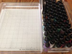
One of the techniques that I wanted to try was alcohol inks floated on water. I found an old plastic picture frame box and filled it with about a half inch of water.

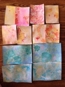
I dropped different shades of yellows and oranges into the water and a couple of drops of blending solution. I gently swirled it around and then slid a 5.5 x 4.25 piece of regular Neenah Solar White paper into it. It’s really different. You have absolutely no control over the process! Sometimes the backs are even prettier than the fronts. You get what you get.

I laid the piece aside to dry and added a second piece of paper. The results were much lighter. You can keep adding more ink to the water without changing it as long as you stay in the same color family.

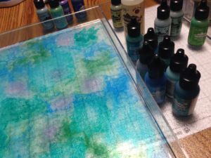
I changed the water and started to work with shades of blues and greens. Because my container was so big I realized that I could add two half sheets of paper at the same time, or even a whole sheet. Instead of sliding them into the water I just laid them on top. You don’t get the color on the back but it is much faster and more efficient.

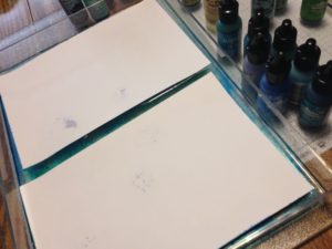
I left the pieces to dry overnight. The colors are much more vibrant after they dry. Because you are working on regular cardstock they are also heavily warped. To flatten them, place them between a piece of folded copy paper and iron them or place them between your plastic plates and run them through your die cutting machine.

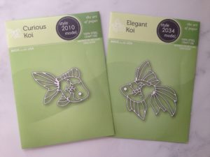
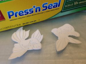
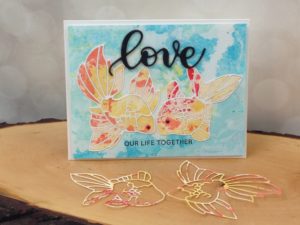
Today, for the card, I wanted to use two new dies from Poppy Stamps, the  Curious Koi and the Elegant Koi.

While I had no control of the background papers I did want to have some control of the placement of the dies. The dies are solid so it is difficult to place them precisely. First, I cut them out of white cardstock. Putting Press’n Seal on the back helps to keep the pieces in order.

I used the leftover opening as a frame to pick out the background that I wanted. I placed the outline back in as well to see if I liked the results.

Next, I removed the outline and placed the die back into the cutout. You will feel when it falls into place. Tape it down and run it through your machine. I laid Press’n Seal on the back of these pieces as well to keep them in order. (see pics above and below)

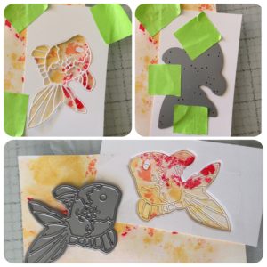
I chose a blue background and glued the koi white outlines on top. It is easy to add glue to the openings and inlay the colored pieces.

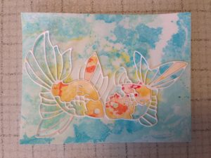
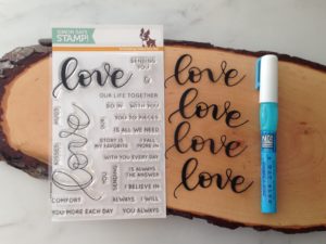
Next, I stamped the sentiment from the Simon Says Stamp “Hey Love” stamp set series. I die cut four “loves” out of black cardstock using the coordinating die and glued them together.

To finish the card I added blacks dot to the eyes with a Gelly Roll pen and then added glossy accents on top.

Full disclosure: After I finished the card and this tutorial I realized that both of my koi fish were upside down. Yep…upside down! Go ahead, turn your computer upside down and look. I’ll wait for you. I am sitting here shaking my head in total disbelief. I am hoping that if it took me that long to figure it out maybe nobody else will notice…or care. Also, I am not starting over! I still have the colored outlines to make another card. I will do better and get that one right! LOL

Joyfully, Jo Ann

SaveSave

SaveSave

SaveSave

SaveSave

SaveSave

SaveSave

SaveSave

SaveSave

SaveSave

SaveSave

SaveSave

SaveSave

SaveSave

3
Share

You also might be interested in

Creative Sundays With Jo Ann: Ocean Border Thanks

Creative Sundays With Jo Ann: Ocean Border Thanks

Mar 17, 2019

One of my favorite places in the world is the[...]

Honey Bee Sneak Peek Day Three: You Make Me Ridiculously Happy

Honey Bee Sneak Peek Day Three: You Make Me Ridiculously Happy

Feb 21, 2018

It’s Release Week at Honey Bee Stamps. This is Day[...]

Creative Sundays With Jo Ann: Fluttering By

Creative Sundays With Jo Ann: Fluttering By

May 5, 2019

Happy Sunday my creative friends. There is nothing more majestic[...]

Hello......I'm Jo Ann

Christian, wife, and proud mother and grandma. I love to create art, cook, read a good book, take photos, and travel. -Enjoy life now...this is not a rehearsal!

....

While this blog is my personal journey I hope that you find something here that encourages you to unfurl your wings and be creative. Most everybody has a little childlike creativity in them just waiting to be set free. It doesn't have to be perfect... just create.

....

…………………………………………..

Enter your email address below to subscribe to this blog. You will receive notifications of new posts by email.


* indicates required


*Check your email to confirm subscription.

…………………………………………..

Categories

  • Action Card
  • Alcohol Inks
  • Altered Art
  • Backgrounds
  • Banners
  • Birthday
  • Bookmark
  • Cards
  • Chalk
  • Christmas
  • Colored Pencils
  • Congratulations
  • Copics
  • Distress Inks
  • Distress Oxide Inks
  • Easter
  • Embossing
  • Embossing Paste
  • Encouragement Cards
  • Fall
  • Father's Day
  • Foiling
  • Friend
  • General
  • Get Well
  • Gift Card Holder
  • Gift Tags
  • Graduation
  • Halloween
  • Hello
  • Holiday
  • Holiday Decor
  • Home Decor
  • Ink Blending
  • Interactive
  • Love
  • Markers
  • Masking
  • Miss You
  • Mother's Day
  • New Years
  • No Line Coloring
  • One Layer Cards
  • Ornaments
  • Patriotic
  • Placemats
  • Project
  • Scene Building
  • Shadow Box Cards
  • Shaker Cards
  • Shape Cards
  • Shared Thoughts
  • Shrinky Dinks
  • St. Patrick's Day
  • Stencils
  • Sympathy
  • Tags
  • Techniques
  • Texture Paste
  • Thank You
  • Tools
  • Uncategorized
  • Valentines
  • Wall Art
  • Watercolor
  • Wedding / Anniversary
  • Wreath Builder

Archives

  • June 2019
  • May 2019
  • April 2019
  • March 2019
  • February 2019
  • January 2019
  • December 2018
  • November 2018
  • October 2018
  • September 2018
  • August 2018
  • July 2018
  • June 2018
  • May 2018
  • April 2018
  • March 2018
  • February 2018
  • January 2018
  • December 2017

Recent Posts

  • Midweek Creations With Jo Ann: Floral Cross Background
  • Creative Sundays With Jo Ann: Goodbyes Are Not Forever
  • Midweek Creations With Jo Ann: Tropical Rainforest Shaker Card
  • National Honey Bee Day Blog Hop: You’re The Bee’s Knees
  • Creative Sundays With Jo Ann: Mandala Love

Tags

Angel Policy Stamp Set and Dies Backgrounds Bill The Bear Stamp Set and Dies Birthday Cardmaking Cards Christmas Cloud Border Die Set Colored Pencils Copics Design Team Die Cutting Dies Distress Inks Distress Oxide Inks Encouragement Feelin' Foxy Stamp Set and Dies Friend General Hand Drawing Heat Embossing Holiday Honey Bee Stamps Ink Blending Love Mae The Mouse Stamp Set and Dies Markers Masking Misti Tool New Release One Layer Cards Papercrafting Penny The Platypus Stamp Set and Dies Pinky The Pig Stamp and Die Set Projects Scene Building Snow Buddies Stamp Set and Dies Stamping Stamps Techniques Tools Trinity Stamps Tutorial Valentines Watercolor

Instagram Feed

jadanchik

A study in two different mediums… Tim Holtz WC D A study in two different mediums…
Tim Holtz WC Distress Pencils -v- Windsor & Newton Cotman WC Paints. 👩‍🎨🎨
—————
1. On the right is my original painting using W & N paints. I mixed equal parts Intense Blue and Cadmium Red Pale Hue to make black. I added additional water and thinned down washes to the bird to make the blooms and drips. As the paint thins out it creates lovely bluish tints.
2. On the left I used Tim’s WC Pencils. Distress Black Soot Ink has the unique property of maintaining its true black color as it’s thinned with water. The pencils do as well. Hmmm 🤔 To remedy this I quickly made a thin wash with Prize Ribbon while the painting was still wet. I alternated adding thinned blobs of the black and blue wash until I got the desired results.
—————
The more I study it…the more I prefer the raven on the left! Do you have a favorite?
—————
@tim_holtz @ranger_ink #timholtz #distress #distressinks #distresspencils
When you still have your new pencils out…but hav When you still have your new pencils out…but have no idea what to do with yourself. Cleaning your mess is not the answer. 😜 Then out of the corner of your eye you see Tim’s new “Unraveled” stamp set from Stamper’s Anonymous and some leftover scraps of watercolor paper. You just start to paint. Not sure what it will become when I fussy cut it. Mum(my)’s the word! 🤫
—————
(Swipe left for process pics)
1. Stamped with Antique Linen Distress ink for no line painting.
2. Antique Linen says it all. It’s in the name! But it was too dark so I made a wash and added some Picket Fence to lighten it. The brown is a mix of Walnut Stain and Black Soot.
—————
@tim_holtz @stampersanonymous @ranger_ink #timholtz #stampersanonymous #distress #distressinks #distresspencils
Still testing out the new Tim Holtz Distress Penci Still testing out the new Tim Holtz Distress Pencils. And how much fun is Tim’s new “The Scarecrow” stamp set from Stamper’s Anonymous? 🧡
—————
(Swipe right for process pics)
1. I stamped the scene using Antique Linen Distress Ink for no line painting with the watercolor pencils.
2. I realized that I put the sun on the right but the shadows on the scarecrow are also on the right. 🤔 Simple fix. I wet the shadow lines and lifted them with a paper towel. The crow and the plaid shirt are my favorite parts!!
3. I wanted to create some color blends so I made some heavily pigmented washes.
4. I wasn’t sure how to add a background at this point without a lot of masking. I carefully flooded the paper with water, avoiding the painted areas, and floated in several different light color washes.
—————
@tim_holtz @stampersanonymous @ranger_ink #timholtz #stampersanonymous #distressink #distress #distresspencils
I know…I know…no posts for 2+ years and now he I know…I know…no posts for 2+ years and now here I am posting again! 😜 I would have made this a reel, but after an hour of trying to figure it out I gave up. 🫤
—————
After painting the cat, crow, and bats yesterday I immediately thought of Tim Holtz’s new “Gothic Tapestry” skull from Stamper’s Anonymous. And I wanted to play with my new Distress Pencils some more…of course I did!
—————
I stamped a partial picture using Hickory Smoke Oxide ink. The watercolor paper (140lb cold press) was very textured so the impression is sketchy at best, but I didn’t need a lot of details.
—————
I love it! (Hubby thinks that it looks like Chewbacca!! 😂) 

We are going to need open stock on the black pencil!! @ranger_ink @tim_holtz @stampersanonymous #timholtz #stampersanonymous #distress #distresspencils #watercolopencils
Part Two I tested several of my favorite watercolo Part Two
I tested several of my favorite watercolor pencil methods still using the Windsor & Newton professional cold press 140 lb watercolor paper. High quality paper is oftentimes more important than the quality of paint in getting good results.
1. The first swatch is pencil scribbled directly onto the paper and activated with a water brush. The Seedless Preserves is highly pigmented but a little harder to break down and dissolve. Darker reds and purples sometimes behave this way.
2. The second swatch is dipping the tip of the pencil in the water and smoothing with a wet brush. This delivers a large pigment load. You can also run a wet brush over the tip of the pencil  and then paint. These offer very smooth results.
3. The third swatch is a wash. I like to create a controlled wash. Yes…you can do this easily with pencils. Add a few drops of water to a porcelain well. Run your water brush over the tip of the pencil and swirl it into the water. Repeat multiple times until you get the paint to water ratio that you want. With a wash you can add many layers to your painting.
4. The top picture shows how well the colors lift. This is useful info for adding highlights and shading or if you accidentally drop color in an unwanted area. Being Distress Inks, they don’t appear to react quite the same to water droplets as regular Distress Inks. They do lift when dry, but some colors stain more than others.
(continued in comments)
timholtz @ranger_ink #timholtz #distress #distresspencils #watercolorpencils
Part One I have been watching for the UPS driver a Part One
I have been watching for the UPS driver all week. When my package of Distress Pencils arrived yesterday afternoon I nearly snatched it from their hands! 😂
I work a lot with different watercolor paints, pencils, and crayons so I was eager to play with them. I used Windsor & Newton professional cold press 140 lb watercolor paper to test them. It’s bumpy so you get a lot of white space when you scribble on the pigment.
1. As I tend to layer colors I immediately put them into color families. I know that you like to dig for them Tim but I need them in color order and don’t have your patience. You are a “hunter” and I am a “gatherer.” 😜
2. I swatched them out…not only to have a chart but to check on several properties. It shows me how easily the different colors dissolve on the paper but also how they “water down” into a wash near the bottom of the swatch. The black line shows their transparency. Most colors are highly pigmented, yet transparent, and easy to dissolve.
So far I am loving them!!! (More in next post.)
@tim_holtz @ranger_ink  #timholtz #distress #distresspencils #watercolorpencils
I have been doing a lot of watercoloring this summ I have been doing a lot of watercoloring this summer and thought that I might start posting again. (I haven’t shared my art work socially in over 2 years.) I painted these three Halloween Decoration Cards this morning using Windsor & Newton paints. They are from an older Michael’s class (free) taught by Mandy Peltier. They were a hoot to paint!
@mandypeltierartist @michaelsstores @winsorandnewton #winsorandnewton #makeitwithmichaels #michaelsclasses
Sometimes it is hard to step back, reevaluate, and Sometimes it is hard to step back, reevaluate, and admit that you need to see things differently!! These are powerful phrases that I intend to learn and to use gracefully.
—————
Thanks my friend for allowing me to share your wise words! ❤️@turnertr03
I am learning. I am listening. #blackouttuesday #a I am learning. I am listening.
#blackouttuesday #amplifymelanatedvoices
Load More... Follow on Instagram

Copyright Statement:

All content, including text, photos, and projects are the property of  Jo Ann Danchik. I encourage you to use this blog as inspiration for your personal projects. If you use any parts of this blog on another blog, website, or in any other public forum, please link back to this blog at jadanchik.com rather than copy and paste any of the information.


© [2017] · Jo Ann Danchik · All Rights Reserved.

Prev Next