• Home
  • About
  • Disclosure
  • FAQ
  • Contact Me
jadanchik.comjadanchik.com
  • Home
  • About
  • Disclosure
  • FAQ
  • Contact Me

Creative Sundays With Jo Ann: Birthday Bear – Part Two

Creative Sundays With Jo Ann: Birthday Bear – Part Two

Creative Sundays With Jo Ann: Birthday Bear – Part Two

September 2, 2018 Posted by Jo Ann Danchik Backgrounds, Birthday, Cards, Distress Inks, Scene Building, Shadow Box Cards, Techniques, Watercolor

I am back this week to share with you the inside of last week’s card blog post. 

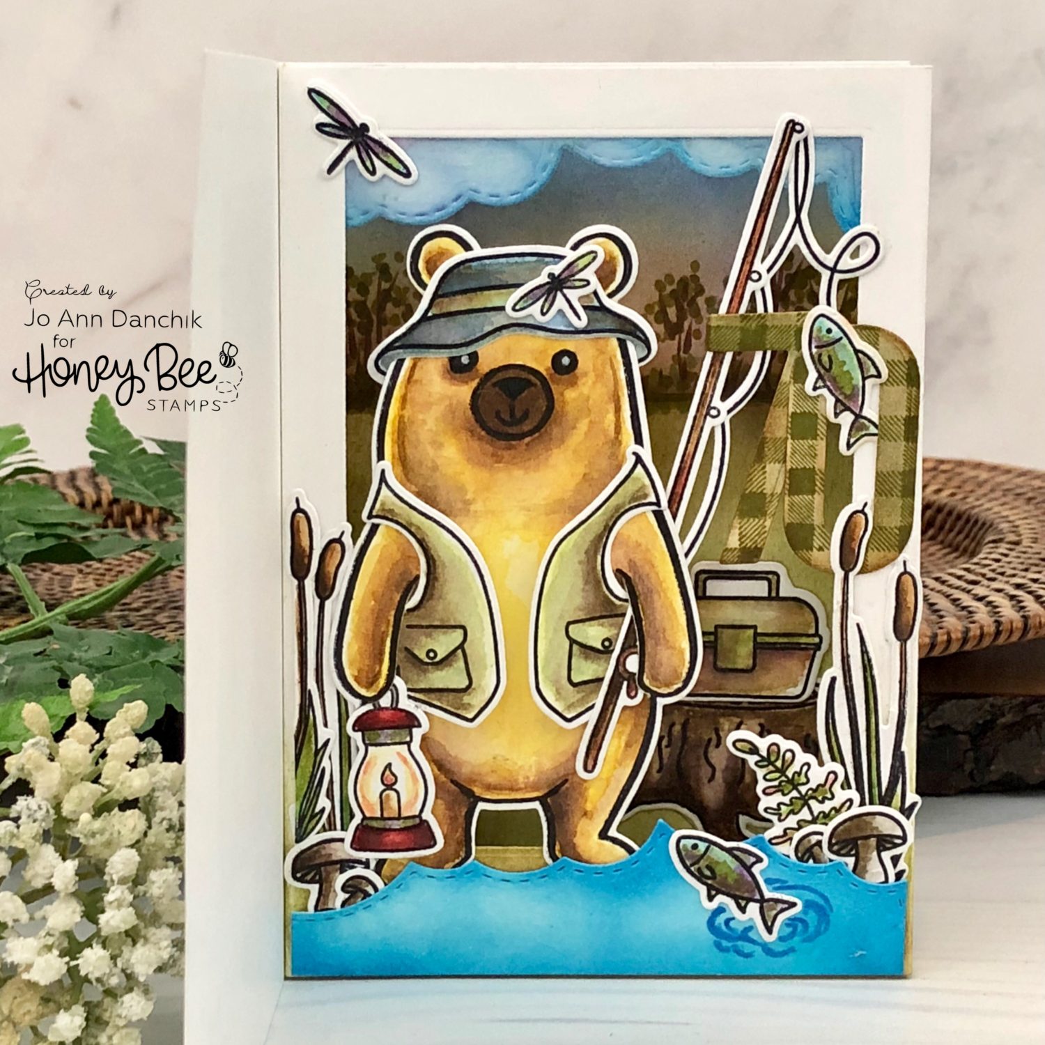
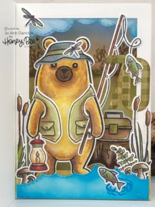
As I stated last week, a family member had reached the “Big 7-0 Birthday” and I wanted to create a special card that reflected and honored him. He is a retired sheriff (front of card) and an avid fisherman (inside of card). This card was split into two blogs to cut down on it’s length. For those who are just joining this adventure, you will find a link at the end of the post for Part One. So let’s jump right in and get started.

____________________

(Products highlighted in teal are active links to the shop.)

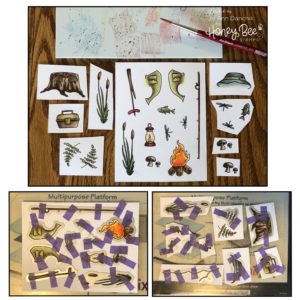
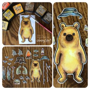
I stamped multiple images, from the Bill The Bear Stamp Set, onto Tim Holtz Watercolor Cardstock, using Ranger Black Archival Ink. There are so many fun pieces in this set…I wanted to use them all! When I don’t know where to start I find it easiest to stamp and watercolor multiple images and then figure out the layout. Leftover pieces can always be used on another card. All the images were watercolored using Distress Inks and a DaVinci Cosmotop Spin watercolor brush. They were die cut, using the coordinating Bill The Bear Die Set, and my favorite Purple Tape. I am so thankful for the dies. I would not have wanted to fussy cut all those pieces!!

I watercolored Bill…the bear…using Scattered Straw, Fossilized Amber, Wild Honey, Vintage Photo, Brushed Corduroy, and Walnut Stain Distress Inks. I used a Black Sakura Gel Pen to fill in and enlarge his eyes and nose. In later pictures you can see where I went back in and gave him a mouth as well. A White Sakura Gel Pen added a little twinkle to his eyes.

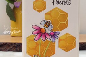
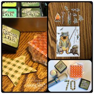
I laid the pieces out on an A2 card panel to start setting up the scene. I needed to figure out how to incorporate more pieces onto the card front. While I was contemplating the layout, I cut out the “70” from a scrap of cardstock, using the Bee Bold Numeric Die Set. I stamped the plaid pattern, from the Bitty Patterns Stamp Set, with Peeled Paint Distress Ink.  I went over it lightly, with a Tim Holtz Distress Brush and Bundled Sage Distress Ink, for a two tone plaid.

After two days of pushing the pieces around on my desk I remembered shadow box cards. They aren’t new, but Jennifer McGuire has several videos featuring them and has brought them back into the spotlight! You can check them out here and here.

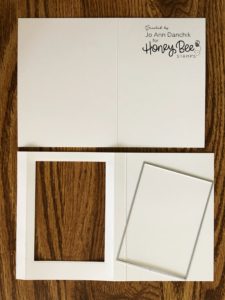
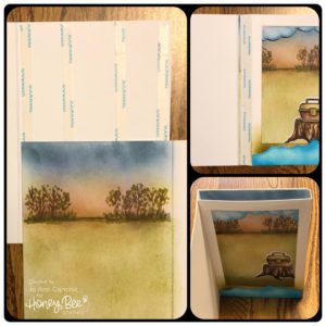
To make a shadow box card foundation:

1. Cut an 8.5” X 11” piece of #110 Neenah cardstock in half, leaving you with two 8.5” X 5.5” pieces.
2. Score and fold one piece at 4.25”
3. Cut off a .5” from one side. (top pic, right side)
4. Score and fold the second piece at .5”, 4.25”, and 4.75”
5. Cut a sliver off on the side with the first fold (looking at the pic, the bottom left)
6. Create a window using any shape die. I used a large rectangle.

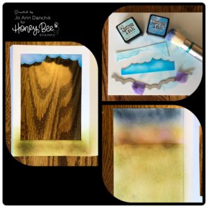
I cut a small scrap of cardstock using the Cloud Borders Die Set. The top piece became my clouds and sky using Tumbled Glass Distress Ink and a Distress Brush. The bottom piece became water using Salty Ocean Distress Ink.

I attached the sky to the inside of the box panel. I roughly added some greens and browns to the bottom front of the panel. Most of this will be covered with the water and die cut images.

Open the box up to create the inside background. I lightly blended on some green and brown Distress Ink colors with a Distress Brush. Again, I really didn’t worry about it too much. Most of it will get covered. My goal was to get rid of the white and give a hint of a background. 

To assemble the card:

1. Lay some strong adhesive along the back of the card. I used 1/4” Scor Tape. This would be the piece that you had cut .5” off the edge. (see earlier pic – top piece, right side.)
2. Lay the background piece on top. Line up inside fold line.
3. Fold piece flat. Add more Scor Tape along edge. 

At this point I added the water to the bottom front edge. I also added the tree stump and tackle box to the inside. I thought that it needed something more, so I grabbed some random Copic markers and scribbled in some trees and shrubs along the horizon.

4. While holding the box frame flat, close the front of the card.
5. You can see (bottom right pic) that this now forms a shadow box inside your card.

I added the cattails, fronds, and mushrooms to the sides and positioned the Bear. He is secure because he is attached on the bottom, behind his arm on the left side, at the fishing pole on the top, and with the “0” on the right side. I find it easiest to use wet glue. It gives you more time to wiggle things into position. I added some ripple lines around the fish with a blue Copic marker.

Several thoughts about this card:

1. I thought that I would gain more real estate in making this card, giving me more room for all those small images. I actually ended up with less. You lose a half inch on each side. What you gain is much more depth, without having to add dimensional tape. The card still lays relatively flat when folded shut and will mail easily.

2. There is a lot going on in this card…don’t let it overwhelm you. This stamp set is amazing and offers many choices for card making and scrapbooking. I know that I will use it many times on future cards, but on a much smaller scale. I could have created 3-4 regular cards with all of these images! I call complex cards like this “One and Done.” (LOL) Choose the parts of this card that work for you.

3. Consider the TRASH FACTOR when making a card like this. This is something that Kathy Racoosin (30 Day Coloring Challenge) often reminds us of. Will the recipient look at it, thank you, then throw it in the trash…or will it be treasured and saved? I know that this will be proudly displayed on a bookshelf, along with the other special cards that I have made for him.

If you want to see how the card front was created click here or on the picture below.

As always, thank you for sharing a bit of your time with me today on another creative journey. 

Joyfully, Jo Ann

Supplies used:
The products that I used are listed below in compensated affiliate links. You can click the icon of your choice, below the product picture, to go directly to your favorite shop. There is NO additional cost to you when using these links. Thank you for your support!


3
Share

You also might be interested in

Creative Sundays With Jo Ann: Kiss Me…I’m Irish

Creative Sundays With Jo Ann: Kiss Me…I’m Irish

Mar 11, 2018

We are Painting Instagram Green over at Honey Bee Stamps. Join in[...]

Creative Sundays With Jo Ann: Bunny Tryouts Today

Creative Sundays With Jo Ann: Bunny Tryouts Today

Mar 4, 2018

Easter will soon be here, and along with it comes[...]

Creative Sundays With Jo Ann: Sending Halloween Witches

Creative Sundays With Jo Ann: Sending Halloween Witches

Sep 16, 2018

Fall brings us a paintbox of beautiful jewel tone colors.[...]

Hello......I'm Jo Ann

Christian, wife, and proud mother and grandma. I love to create art, cook, read a good book, take photos, and travel. -Enjoy life now...this is not a rehearsal!

....

While this blog is my personal journey I hope that you find something here that encourages you to unfurl your wings and be creative. Most everybody has a little childlike creativity in them just waiting to be set free. It doesn't have to be perfect... just create.

....

…………………………………………..

Enter your email address below to subscribe to this blog. You will receive notifications of new posts by email.


* indicates required


*Check your email to confirm subscription.

…………………………………………..

Categories

  • Action Card
  • Alcohol Inks
  • Altered Art
  • Backgrounds
  • Banners
  • Birthday
  • Bookmark
  • Cards
  • Chalk
  • Christmas
  • Colored Pencils
  • Congratulations
  • Copics
  • Distress Inks
  • Distress Oxide Inks
  • Easter
  • Embossing
  • Embossing Paste
  • Encouragement Cards
  • Fall
  • Father's Day
  • Foiling
  • Friend
  • General
  • Get Well
  • Gift Card Holder
  • Gift Tags
  • Graduation
  • Halloween
  • Hello
  • Holiday
  • Holiday Decor
  • Home Decor
  • Ink Blending
  • Interactive
  • Love
  • Markers
  • Masking
  • Miss You
  • Mother's Day
  • New Years
  • No Line Coloring
  • One Layer Cards
  • Ornaments
  • Patriotic
  • Placemats
  • Project
  • Scene Building
  • Shadow Box Cards
  • Shaker Cards
  • Shape Cards
  • Shared Thoughts
  • Shrinky Dinks
  • St. Patrick's Day
  • Stencils
  • Sympathy
  • Tags
  • Techniques
  • Texture Paste
  • Thank You
  • Tools
  • Uncategorized
  • Valentines
  • Wall Art
  • Watercolor
  • Wedding / Anniversary
  • Wreath Builder

Archives

  • June 2019
  • May 2019
  • April 2019
  • March 2019
  • February 2019
  • January 2019
  • December 2018
  • November 2018
  • October 2018
  • September 2018
  • August 2018
  • July 2018
  • June 2018
  • May 2018
  • April 2018
  • March 2018
  • February 2018
  • January 2018
  • December 2017

Recent Posts

  • Midweek Creations With Jo Ann: Floral Cross Background
  • Creative Sundays With Jo Ann: Goodbyes Are Not Forever
  • Midweek Creations With Jo Ann: Tropical Rainforest Shaker Card
  • National Honey Bee Day Blog Hop: You’re The Bee’s Knees
  • Creative Sundays With Jo Ann: Mandala Love

Tags

Angel Policy Stamp Set and Dies Backgrounds Bill The Bear Stamp Set and Dies Birthday Cardmaking Cards Christmas Cloud Border Die Set Colored Pencils Copics Design Team Die Cutting Dies Distress Inks Distress Oxide Inks Encouragement Feelin' Foxy Stamp Set and Dies Friend General Hand Drawing Heat Embossing Holiday Honey Bee Stamps Ink Blending Love Mae The Mouse Stamp Set and Dies Markers Masking Misti Tool New Release One Layer Cards Papercrafting Penny The Platypus Stamp Set and Dies Pinky The Pig Stamp and Die Set Projects Scene Building Snow Buddies Stamp Set and Dies Stamping Stamps Techniques Tools Trinity Stamps Tutorial Valentines Watercolor

Instagram Feed

jadanchik

A study in two different mediums… Tim Holtz WC D A study in two different mediums…
Tim Holtz WC Distress Pencils -v- Windsor & Newton Cotman WC Paints. 👩‍🎨🎨
—————
1. On the right is my original painting using W & N paints. I mixed equal parts Intense Blue and Cadmium Red Pale Hue to make black. I added additional water and thinned down washes to the bird to make the blooms and drips. As the paint thins out it creates lovely bluish tints.
2. On the left I used Tim’s WC Pencils. Distress Black Soot Ink has the unique property of maintaining its true black color as it’s thinned with water. The pencils do as well. Hmmm 🤔 To remedy this I quickly made a thin wash with Prize Ribbon while the painting was still wet. I alternated adding thinned blobs of the black and blue wash until I got the desired results.
—————
The more I study it…the more I prefer the raven on the left! Do you have a favorite?
—————
@tim_holtz @ranger_ink #timholtz #distress #distressinks #distresspencils
When you still have your new pencils out…but hav When you still have your new pencils out…but have no idea what to do with yourself. Cleaning your mess is not the answer. 😜 Then out of the corner of your eye you see Tim’s new “Unraveled” stamp set from Stamper’s Anonymous and some leftover scraps of watercolor paper. You just start to paint. Not sure what it will become when I fussy cut it. Mum(my)’s the word! 🤫
—————
(Swipe left for process pics)
1. Stamped with Antique Linen Distress ink for no line painting.
2. Antique Linen says it all. It’s in the name! But it was too dark so I made a wash and added some Picket Fence to lighten it. The brown is a mix of Walnut Stain and Black Soot.
—————
@tim_holtz @stampersanonymous @ranger_ink #timholtz #stampersanonymous #distress #distressinks #distresspencils
Still testing out the new Tim Holtz Distress Penci Still testing out the new Tim Holtz Distress Pencils. And how much fun is Tim’s new “The Scarecrow” stamp set from Stamper’s Anonymous? 🧡
—————
(Swipe right for process pics)
1. I stamped the scene using Antique Linen Distress Ink for no line painting with the watercolor pencils.
2. I realized that I put the sun on the right but the shadows on the scarecrow are also on the right. 🤔 Simple fix. I wet the shadow lines and lifted them with a paper towel. The crow and the plaid shirt are my favorite parts!!
3. I wanted to create some color blends so I made some heavily pigmented washes.
4. I wasn’t sure how to add a background at this point without a lot of masking. I carefully flooded the paper with water, avoiding the painted areas, and floated in several different light color washes.
—————
@tim_holtz @stampersanonymous @ranger_ink #timholtz #stampersanonymous #distressink #distress #distresspencils
I know…I know…no posts for 2+ years and now he I know…I know…no posts for 2+ years and now here I am posting again! 😜 I would have made this a reel, but after an hour of trying to figure it out I gave up. 🫤
—————
After painting the cat, crow, and bats yesterday I immediately thought of Tim Holtz’s new “Gothic Tapestry” skull from Stamper’s Anonymous. And I wanted to play with my new Distress Pencils some more…of course I did!
—————
I stamped a partial picture using Hickory Smoke Oxide ink. The watercolor paper (140lb cold press) was very textured so the impression is sketchy at best, but I didn’t need a lot of details.
—————
I love it! (Hubby thinks that it looks like Chewbacca!! 😂) 

We are going to need open stock on the black pencil!! @ranger_ink @tim_holtz @stampersanonymous #timholtz #stampersanonymous #distress #distresspencils #watercolopencils
Part Two I tested several of my favorite watercolo Part Two
I tested several of my favorite watercolor pencil methods still using the Windsor & Newton professional cold press 140 lb watercolor paper. High quality paper is oftentimes more important than the quality of paint in getting good results.
1. The first swatch is pencil scribbled directly onto the paper and activated with a water brush. The Seedless Preserves is highly pigmented but a little harder to break down and dissolve. Darker reds and purples sometimes behave this way.
2. The second swatch is dipping the tip of the pencil in the water and smoothing with a wet brush. This delivers a large pigment load. You can also run a wet brush over the tip of the pencil  and then paint. These offer very smooth results.
3. The third swatch is a wash. I like to create a controlled wash. Yes…you can do this easily with pencils. Add a few drops of water to a porcelain well. Run your water brush over the tip of the pencil and swirl it into the water. Repeat multiple times until you get the paint to water ratio that you want. With a wash you can add many layers to your painting.
4. The top picture shows how well the colors lift. This is useful info for adding highlights and shading or if you accidentally drop color in an unwanted area. Being Distress Inks, they don’t appear to react quite the same to water droplets as regular Distress Inks. They do lift when dry, but some colors stain more than others.
(continued in comments)
timholtz @ranger_ink #timholtz #distress #distresspencils #watercolorpencils
Part One I have been watching for the UPS driver a Part One
I have been watching for the UPS driver all week. When my package of Distress Pencils arrived yesterday afternoon I nearly snatched it from their hands! 😂
I work a lot with different watercolor paints, pencils, and crayons so I was eager to play with them. I used Windsor & Newton professional cold press 140 lb watercolor paper to test them. It’s bumpy so you get a lot of white space when you scribble on the pigment.
1. As I tend to layer colors I immediately put them into color families. I know that you like to dig for them Tim but I need them in color order and don’t have your patience. You are a “hunter” and I am a “gatherer.” 😜
2. I swatched them out…not only to have a chart but to check on several properties. It shows me how easily the different colors dissolve on the paper but also how they “water down” into a wash near the bottom of the swatch. The black line shows their transparency. Most colors are highly pigmented, yet transparent, and easy to dissolve.
So far I am loving them!!! (More in next post.)
@tim_holtz @ranger_ink  #timholtz #distress #distresspencils #watercolorpencils
I have been doing a lot of watercoloring this summ I have been doing a lot of watercoloring this summer and thought that I might start posting again. (I haven’t shared my art work socially in over 2 years.) I painted these three Halloween Decoration Cards this morning using Windsor & Newton paints. They are from an older Michael’s class (free) taught by Mandy Peltier. They were a hoot to paint!
@mandypeltierartist @michaelsstores @winsorandnewton #winsorandnewton #makeitwithmichaels #michaelsclasses
Sometimes it is hard to step back, reevaluate, and Sometimes it is hard to step back, reevaluate, and admit that you need to see things differently!! These are powerful phrases that I intend to learn and to use gracefully.
—————
Thanks my friend for allowing me to share your wise words! ❤️@turnertr03
I am learning. I am listening. #blackouttuesday #a I am learning. I am listening.
#blackouttuesday #amplifymelanatedvoices
Load More... Follow on Instagram

Copyright Statement:

All content, including text, photos, and projects are the property of  Jo Ann Danchik. I encourage you to use this blog as inspiration for your personal projects. If you use any parts of this blog on another blog, website, or in any other public forum, please link back to this blog at jadanchik.com rather than copy and paste any of the information.


© [2017] · Jo Ann Danchik · All Rights Reserved.

Prev Next