• Home
  • About
  • Disclosure
  • FAQ
  • Contact Me
jadanchik.comjadanchik.com
  • Home
  • About
  • Disclosure
  • FAQ
  • Contact Me

Creative Sundays With Jo Ann: Love You-Hexagon Shaped Card

Creative Sundays With Jo Ann: Love You-Hexagon Shaped Card

Creative Sundays With Jo Ann: Love You-Hexagon Shaped Card

July 15, 2018 Posted by Jo Ann Danchik Cards, Distress Inks, General, Ink Blending, Love, Markers, Shape Cards, Techniques, Watercolor

Hi creative friends! Two weeks ago I was honored to represent Honey Bee Stamps as a Guest Designer on the Simon Says Stamp Blog. I am now able to share my card with you here as well.

____________________

(Compensated affiliate links are used with NO cost to you. Products highlighted in teal are active links. All the supplies used are also linked to multiple shops at the end of the post. Thank you for your support!)

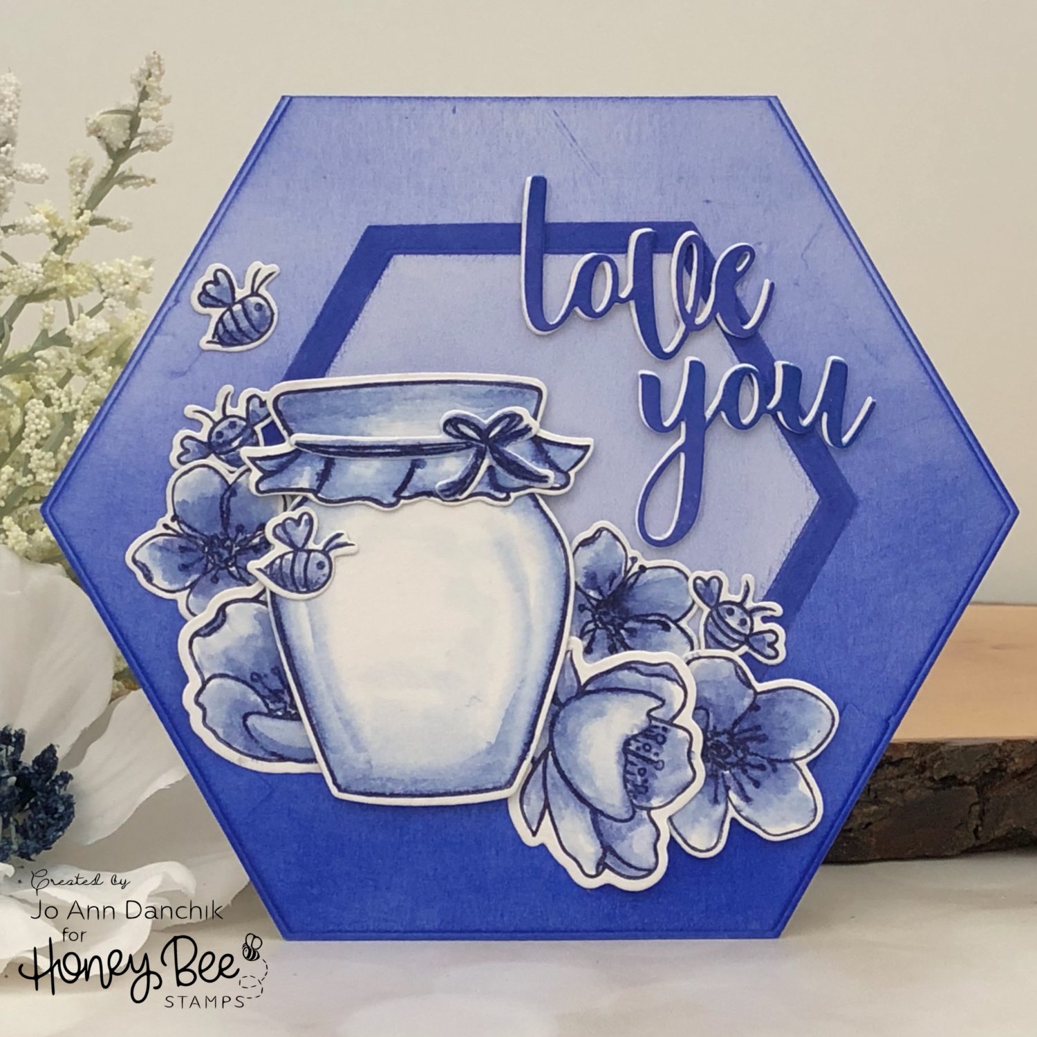
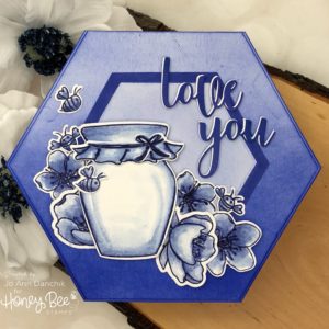
I drew my inspiration for the card from the Dutch Blue Delft Tiles that I saw in Amsterdam many years ago. I thought that it would be fun to create a card using only shades of blue.

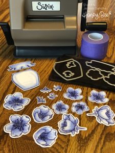
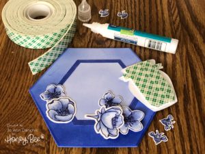
I started by using the small blooms, from the Sweet As Honey Stamp Set, and the larger blooms, from the newer Spring Blossoms Stamp Set. Both sets pair beautifully together. I inked up the stamps using an African Violet Marvy LePlume marker. I find that the Tombow markers work equally as well. Both brands hold a lot of pigment, are easy to stamp with, and can handle a lot of water. I stamped onto the smoother side of Tim Holtz’s Watercolor Paper. I used a MISTI, as it took several inkings to get good coverage on the textured paper.

Starting from the center of each blossom, and using a nearly dry watercolor brush, I pulled color from the stamp outline. I added clear water to the edges to lighten the color as I moved out along each petal. While I start out with a general idea of where the card is going, it usually evolves and goes in a different direction. LOL! I decided to add the honey pot and a few bees, also from the Sweet As Honey Stamp Set. They were colored in the same manner.

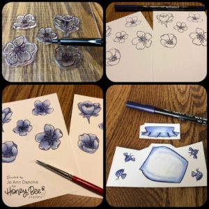
I die cut all the pieces using the coordinating Sweet As Honey Die Set and the Spring Blossom Die Set. The Sizzix Sidekick never leaves my desk. I use it ALL THE TIME!  Also, I have been using the Therm O Web Purple Tape for awhile and love it as well. It releases beautifully and doesn’t tear your paper.

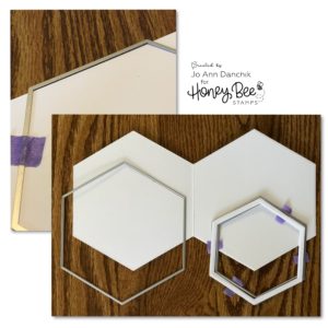
I decided to make the card a hexagonal shape to further mimic a tile. I die cut #110 Neenah Cardstock using the Hexagon Solid Stack die set. Fold your cardstock and make sure that the die is slightly above the cardstock fold to make a shaped card. I also used two smaller dies from the set to create a smaller hexagon frame.

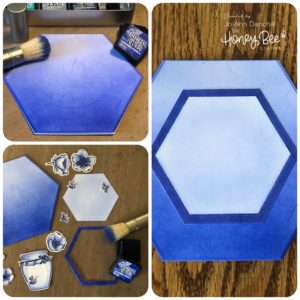
I used Tim Holtz Blueprint Sketch Distress Ink, and one of his new Distress Blending Brushes, for an ombre effect. I continuously added color from the bottom and blended upward. There are some scratch marks on my paper from using old plates on my die cutting machine. I thought about starting over but decided that most of them would be covered and that they added a vintage look.

For the smaller frame I simply went direct-to-paper with the ink cube. I played around with adding the frame to the card and leaving the inside blue…there was not enough contrast. I also tried putting the white inside piece back in…there was too much contrast. I finally settled on brushing a light layer of the Blueprint Sketch Ink on the inside piece. Everything was glued down using a Lawn Fawn Glue Tube. 

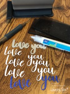
I colored some #80 Neenah Cardstock using the Blueprint Sketch Distress Ink. I cut one blue and three white pieces using the Love You Die Set. They are small thin pieces and are easily released from the die with a Tim Holtz Die Pick…or the Pokey Tool…as most of us refer to it. They were stacked and glued using the Lawn Fawn Glue Tube. I offset the top piece slightly to give a white contrasting edge. It helped to set the sentiment apart from the background.

The pieces were laid out and adhered with the glue tube. Some of the flowers, and the honey pot, were given added dimension with Scotch Foam Tape. 

Thank you for joining me today on this creative journey! I hope that it has inspired you to try your hand at a monochromatic card.

Joyfully,
Jo Ann

Supplies used:
The products that I used are listed below in compensated affiliate links. You can click the icon of your choice, below the product picture, to go directly to your favorite shop. There is NO additional cost to you when using these links. Thank you for your support!


SaveSave

SaveSave

SaveSave

SaveSave

SaveSave

1
Share

You also might be interested in

Creative Sundays With Jo Ann: Birthday Bear – Part One

Creative Sundays With Jo Ann: Birthday Bear – Part One

Aug 26, 2018

I needed a masculine birthday card to celebrate a family[...]

Honey Bee Stamps: Happy 4th BEEday Release Blog Hop

Honey Bee Stamps: Happy 4th BEEday Release Blog Hop

Apr 20, 2019

Today is day TWO of the new Happy BEEday Release[...]

Midweek Creations With Jo Ann: Have An Ice Day 

Midweek Creations With Jo Ann: Have An Ice Day 

Jan 23, 2019

I have fond memories of ice skating as a child.[...]

Hello......I'm Jo Ann

Christian, wife, and proud mother and grandma. I love to create art, cook, read a good book, take photos, and travel. -Enjoy life now...this is not a rehearsal!

....

While this blog is my personal journey I hope that you find something here that encourages you to unfurl your wings and be creative. Most everybody has a little childlike creativity in them just waiting to be set free. It doesn't have to be perfect... just create.

....

…………………………………………..

Enter your email address below to subscribe to this blog. You will receive notifications of new posts by email.


* indicates required


*Check your email to confirm subscription.

…………………………………………..

Categories

  • Action Card
  • Alcohol Inks
  • Altered Art
  • Backgrounds
  • Banners
  • Birthday
  • Bookmark
  • Cards
  • Chalk
  • Christmas
  • Colored Pencils
  • Congratulations
  • Copics
  • Distress Inks
  • Distress Oxide Inks
  • Easter
  • Embossing
  • Embossing Paste
  • Encouragement Cards
  • Fall
  • Father's Day
  • Foiling
  • Friend
  • General
  • Get Well
  • Gift Card Holder
  • Gift Tags
  • Graduation
  • Halloween
  • Hello
  • Holiday
  • Holiday Decor
  • Home Decor
  • Ink Blending
  • Interactive
  • Love
  • Markers
  • Masking
  • Miss You
  • Mother's Day
  • New Years
  • No Line Coloring
  • One Layer Cards
  • Ornaments
  • Patriotic
  • Placemats
  • Project
  • Scene Building
  • Shadow Box Cards
  • Shaker Cards
  • Shape Cards
  • Shared Thoughts
  • Shrinky Dinks
  • St. Patrick's Day
  • Stencils
  • Sympathy
  • Tags
  • Techniques
  • Texture Paste
  • Thank You
  • Tools
  • Uncategorized
  • Valentines
  • Wall Art
  • Watercolor
  • Wedding / Anniversary
  • Wreath Builder

Archives

  • June 2019
  • May 2019
  • April 2019
  • March 2019
  • February 2019
  • January 2019
  • December 2018
  • November 2018
  • October 2018
  • September 2018
  • August 2018
  • July 2018
  • June 2018
  • May 2018
  • April 2018
  • March 2018
  • February 2018
  • January 2018
  • December 2017

Recent Posts

  • Midweek Creations With Jo Ann: Floral Cross Background
  • Creative Sundays With Jo Ann: Goodbyes Are Not Forever
  • Midweek Creations With Jo Ann: Tropical Rainforest Shaker Card
  • National Honey Bee Day Blog Hop: You’re The Bee’s Knees
  • Creative Sundays With Jo Ann: Mandala Love

Tags

Angel Policy Stamp Set and Dies Backgrounds Bill The Bear Stamp Set and Dies Birthday Cardmaking Cards Christmas Cloud Border Die Set Colored Pencils Copics Design Team Die Cutting Dies Distress Inks Distress Oxide Inks Encouragement Feelin' Foxy Stamp Set and Dies Friend General Hand Drawing Heat Embossing Holiday Honey Bee Stamps Ink Blending Love Mae The Mouse Stamp Set and Dies Markers Masking Misti Tool New Release One Layer Cards Papercrafting Penny The Platypus Stamp Set and Dies Pinky The Pig Stamp and Die Set Projects Scene Building Snow Buddies Stamp Set and Dies Stamping Stamps Techniques Tools Trinity Stamps Tutorial Valentines Watercolor

Instagram Feed

jadanchik

A study in two different mediums… Tim Holtz WC D A study in two different mediums…
Tim Holtz WC Distress Pencils -v- Windsor & Newton Cotman WC Paints. 👩‍🎨🎨
—————
1. On the right is my original painting using W & N paints. I mixed equal parts Intense Blue and Cadmium Red Pale Hue to make black. I added additional water and thinned down washes to the bird to make the blooms and drips. As the paint thins out it creates lovely bluish tints.
2. On the left I used Tim’s WC Pencils. Distress Black Soot Ink has the unique property of maintaining its true black color as it’s thinned with water. The pencils do as well. Hmmm 🤔 To remedy this I quickly made a thin wash with Prize Ribbon while the painting was still wet. I alternated adding thinned blobs of the black and blue wash until I got the desired results.
—————
The more I study it…the more I prefer the raven on the left! Do you have a favorite?
—————
@tim_holtz @ranger_ink #timholtz #distress #distressinks #distresspencils
When you still have your new pencils out…but hav When you still have your new pencils out…but have no idea what to do with yourself. Cleaning your mess is not the answer. 😜 Then out of the corner of your eye you see Tim’s new “Unraveled” stamp set from Stamper’s Anonymous and some leftover scraps of watercolor paper. You just start to paint. Not sure what it will become when I fussy cut it. Mum(my)’s the word! 🤫
—————
(Swipe left for process pics)
1. Stamped with Antique Linen Distress ink for no line painting.
2. Antique Linen says it all. It’s in the name! But it was too dark so I made a wash and added some Picket Fence to lighten it. The brown is a mix of Walnut Stain and Black Soot.
—————
@tim_holtz @stampersanonymous @ranger_ink #timholtz #stampersanonymous #distress #distressinks #distresspencils
Still testing out the new Tim Holtz Distress Penci Still testing out the new Tim Holtz Distress Pencils. And how much fun is Tim’s new “The Scarecrow” stamp set from Stamper’s Anonymous? 🧡
—————
(Swipe right for process pics)
1. I stamped the scene using Antique Linen Distress Ink for no line painting with the watercolor pencils.
2. I realized that I put the sun on the right but the shadows on the scarecrow are also on the right. 🤔 Simple fix. I wet the shadow lines and lifted them with a paper towel. The crow and the plaid shirt are my favorite parts!!
3. I wanted to create some color blends so I made some heavily pigmented washes.
4. I wasn’t sure how to add a background at this point without a lot of masking. I carefully flooded the paper with water, avoiding the painted areas, and floated in several different light color washes.
—————
@tim_holtz @stampersanonymous @ranger_ink #timholtz #stampersanonymous #distressink #distress #distresspencils
I know…I know…no posts for 2+ years and now he I know…I know…no posts for 2+ years and now here I am posting again! 😜 I would have made this a reel, but after an hour of trying to figure it out I gave up. 🫤
—————
After painting the cat, crow, and bats yesterday I immediately thought of Tim Holtz’s new “Gothic Tapestry” skull from Stamper’s Anonymous. And I wanted to play with my new Distress Pencils some more…of course I did!
—————
I stamped a partial picture using Hickory Smoke Oxide ink. The watercolor paper (140lb cold press) was very textured so the impression is sketchy at best, but I didn’t need a lot of details.
—————
I love it! (Hubby thinks that it looks like Chewbacca!! 😂) 

We are going to need open stock on the black pencil!! @ranger_ink @tim_holtz @stampersanonymous #timholtz #stampersanonymous #distress #distresspencils #watercolopencils
Part Two I tested several of my favorite watercolo Part Two
I tested several of my favorite watercolor pencil methods still using the Windsor & Newton professional cold press 140 lb watercolor paper. High quality paper is oftentimes more important than the quality of paint in getting good results.
1. The first swatch is pencil scribbled directly onto the paper and activated with a water brush. The Seedless Preserves is highly pigmented but a little harder to break down and dissolve. Darker reds and purples sometimes behave this way.
2. The second swatch is dipping the tip of the pencil in the water and smoothing with a wet brush. This delivers a large pigment load. You can also run a wet brush over the tip of the pencil  and then paint. These offer very smooth results.
3. The third swatch is a wash. I like to create a controlled wash. Yes…you can do this easily with pencils. Add a few drops of water to a porcelain well. Run your water brush over the tip of the pencil and swirl it into the water. Repeat multiple times until you get the paint to water ratio that you want. With a wash you can add many layers to your painting.
4. The top picture shows how well the colors lift. This is useful info for adding highlights and shading or if you accidentally drop color in an unwanted area. Being Distress Inks, they don’t appear to react quite the same to water droplets as regular Distress Inks. They do lift when dry, but some colors stain more than others.
(continued in comments)
timholtz @ranger_ink #timholtz #distress #distresspencils #watercolorpencils
Part One I have been watching for the UPS driver a Part One
I have been watching for the UPS driver all week. When my package of Distress Pencils arrived yesterday afternoon I nearly snatched it from their hands! 😂
I work a lot with different watercolor paints, pencils, and crayons so I was eager to play with them. I used Windsor & Newton professional cold press 140 lb watercolor paper to test them. It’s bumpy so you get a lot of white space when you scribble on the pigment.
1. As I tend to layer colors I immediately put them into color families. I know that you like to dig for them Tim but I need them in color order and don’t have your patience. You are a “hunter” and I am a “gatherer.” 😜
2. I swatched them out…not only to have a chart but to check on several properties. It shows me how easily the different colors dissolve on the paper but also how they “water down” into a wash near the bottom of the swatch. The black line shows their transparency. Most colors are highly pigmented, yet transparent, and easy to dissolve.
So far I am loving them!!! (More in next post.)
@tim_holtz @ranger_ink  #timholtz #distress #distresspencils #watercolorpencils
I have been doing a lot of watercoloring this summ I have been doing a lot of watercoloring this summer and thought that I might start posting again. (I haven’t shared my art work socially in over 2 years.) I painted these three Halloween Decoration Cards this morning using Windsor & Newton paints. They are from an older Michael’s class (free) taught by Mandy Peltier. They were a hoot to paint!
@mandypeltierartist @michaelsstores @winsorandnewton #winsorandnewton #makeitwithmichaels #michaelsclasses
Sometimes it is hard to step back, reevaluate, and Sometimes it is hard to step back, reevaluate, and admit that you need to see things differently!! These are powerful phrases that I intend to learn and to use gracefully.
—————
Thanks my friend for allowing me to share your wise words! ❤️@turnertr03
I am learning. I am listening. #blackouttuesday #a I am learning. I am listening.
#blackouttuesday #amplifymelanatedvoices
Load More... Follow on Instagram

Copyright Statement:

All content, including text, photos, and projects are the property of  Jo Ann Danchik. I encourage you to use this blog as inspiration for your personal projects. If you use any parts of this blog on another blog, website, or in any other public forum, please link back to this blog at jadanchik.com rather than copy and paste any of the information.


© [2017] · Jo Ann Danchik · All Rights Reserved.

Prev Next