• Home
  • About
  • Disclosure
  • FAQ
  • Contact Me
jadanchik.comjadanchik.com
  • Home
  • About
  • Disclosure
  • FAQ
  • Contact Me

Creative Sundays with Jo Ann: Season’s Tweetings – Three Cards…Three Mediums

Creative Sundays with Jo Ann: Season’s Tweetings – Three Cards…Three Mediums

Creative Sundays with Jo Ann: Season’s Tweetings – Three Cards…Three Mediums

January 3, 2018 Posted by Jo Ann Danchik Backgrounds, Colored Pencils, Copics, Distress Inks, Holiday, Masking, One Layer Cards, Scene Building, Techniques, Watercolor

This post was originally seen on the Honey Bee Stamp Blog on 11/19/17. It is being added to my personal blog so that it can be archived. Enjoy!

……….

“Oh Here We Come a Caroling”…or “Wassailing”…as they refer to it in Old England. Whatever you call it, it refers to going door to door and singing Christmas carols. I chuckle when I think of that old Claymation TV special that came out in 1987. They were confused by the words of the song, and dogs selling waffles were singing “Here We Come a Waffling,” followed by geese singing “Here We Come a Waddling,” then pigs singing “Here We Come a Wallowing.” It ended with a truck full of elves drinking hot cider and singing the correct version. I have fond memories of caroling with various church groups, both as a child and as an adult with my children. There were always a couple of houses along our route who would invite us in for hot chocolate, homemade cookies, and candy canes. What fond memories! The tradition of Christmas Caroling was the inspiration for today’s cards.

……….

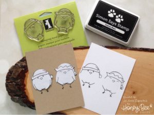
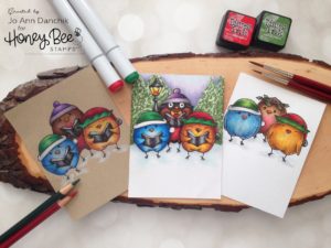
Season’s Tweetings is not only the name of Honey Bee Stamp’s newest collection…it is also the name of the stamp set that I used to make my three cards today. I thought that I would showcase three different mediums, on three different cardstocks, using the same stamp set. They all start with a one layer card layout that is fast and easy. I’ll then move on to some simple ways that you can customize this set for a unique look. So grab a mug of coffee or tea, put your feet up, and let’s start creating.
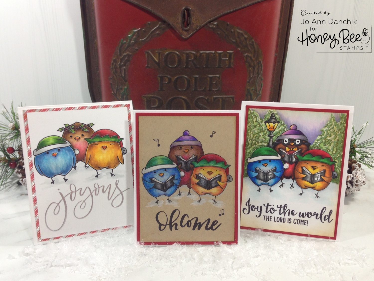
Card One

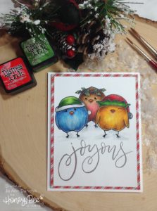
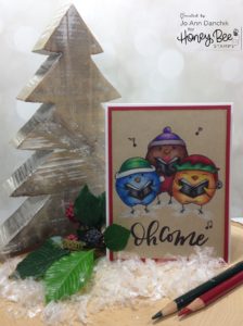
The first card was stamped on Tim Holtz watercolor cardstock, with Ranger’s Jet Black Archival Ink. This ink is perfect when using wet mediums, like watercolors or water based markers. To create a chorus of birds, I stamped the two outside birds and then stamped them again on Inkadinkado masking paper. Once the masks were cut out I covered the two birds and stamped the middle bird, giving it the illusion of being in the back.

Everything was watercolored using Tim Holtz Distress Inks. The sentiment, ‘Joyous,’ is from the same set. It was stamped with Versamark Ink and heat embossed with Ranger’s Liquid Platinum embossing powder. This sentiment is one of my all time favorites…I love the script! To finish the card, I mounted the panel to a piece of Tim Holtz’s glittery Christmas Deco sheets and then taped it to a top folding card base. Like I said, quick and easy card.

Card Two

I stamped another chorus of birds on Kraft cardstock, this time using Simon Says Stamp’s Intense Black ink. Any dye ink will work well when using a dry medium like colored pencils or chalks.

I wanted the birds to be holding music folders so I used post-it tape to mask off the parts of the stamp that I didn’t need. Don’t forget to remove the tape before you stamp your image! I again applied the masks to the two outside birds. This time I used the bird that is holding a cookie to add to the back, only inking the top part of the stamp.

It was easy enough to draw the folders on the bird’s bellies. I used the bird stamp with the cookie as a guideline to draw the wings. I added a pom-pom to the hat of this bird and drew in his bottom half and his feet. A Copic Multiliner was used to draw over my pencil lines.

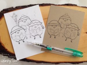
This card was colored using Prismacolor pencils. The waxy nature of these pencils tends to dull your image lines so I went back over them with the Multiliner when I was finished coloring. For the sentiment, I cut off the top line of the Adore Him stamp (gasp). It always makes me a little nervous but if you are careful it really doesn’t harm the stamp and you can always put it back together to use it as it was intended. Hint: cut the stamp with at least one angle or two. It makes it much easier to line it back up properly.

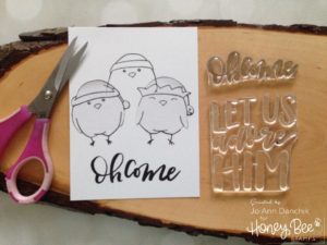
The rest of the sentiment and a couple of music notes were stamped inside the top half of the card. This will leave plenty of room for you to add your message on the bottom half.

I scattered several music notes on the front of the card, mounted it to a piece of red card stock, and taped it to a top folding card base. Another quick and fairly easy one layer card.


Card Three

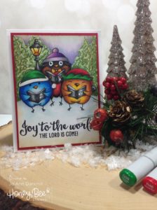
For the last card I stamped the same grouping of birds, as card two, on 80 lb Neenah White Solar Cardstock, again using the Simon Says Stamp Intense Black ink. This ink is a perfect choice when coloring with alcohol or solvent ink markers.

I used the same inking, masking, and drawing techniques as the second card. I also added a pair of glasses and a bow tie to the middle bird, and a lampost to the background. A Copic Multiliner was used to draw in my lines, as it is compatible with alcohol inks.

This card was colored with Copic alcohol markers. The trees are mostly a series of scribbles, giving the illusion of tree shapes. Again, I went back over the image lines with a Copic Multiliner as the Copics tend to dull them a little. The sentiment is from an older set, Joy To The World. This set has smaller music notes so I used them to add notes to the folders, using Versamark and white embossing powder. The panel was mounted to a piece of red card stock and taped to a top folding card base. This card took a little more time and effort, but it still was not terribly difficult to create.

While I tend to reach for my watercolors first and foremost, I really do like the different looks that are achieved using colored pencils and Copic markers. I tried to use similar colors on each card so that you can compare them. Bonus: all three cards are one layer and will go through the mail easily, requiring no extra postage.

Thanks for joining me today on this creative journey.
Joyfully,  Jo Ann

SaveSave

SaveSave

SaveSave

SaveSave

SaveSave

3
Share

You also might be interested in

Honey Bee Sneak Peek Day One: Feel Better

Honey Bee Sneak Peek Day One: Feel Better

Feb 19, 2018

It’s Release Week at Honey Bee Stamps. This is Day[...]

Bee Inspired New Release Week: Fa-La-La-Liday Hat Trio

Bee Inspired New Release Week: Fa-La-La-Liday Hat Trio

Oct 30, 2018

The Honey Bee Stamps Design Team has an exciting week[...]

Midweek Creations With Jo Ann: Thankful For You

Midweek Creations With Jo Ann: Thankful For You

Oct 31, 2018

I love the fall. The leaves put on a dazzling[...]

Hello......I'm Jo Ann

Christian, wife, and proud mother and grandma. I love to create art, cook, read a good book, take photos, and travel. -Enjoy life now...this is not a rehearsal!

....

While this blog is my personal journey I hope that you find something here that encourages you to unfurl your wings and be creative. Most everybody has a little childlike creativity in them just waiting to be set free. It doesn't have to be perfect... just create.

....

…………………………………………..

Enter your email address below to subscribe to this blog. You will receive notifications of new posts by email.


* indicates required


*Check your email to confirm subscription.

…………………………………………..

Categories

  • Action Card
  • Alcohol Inks
  • Altered Art
  • Backgrounds
  • Banners
  • Birthday
  • Bookmark
  • Cards
  • Chalk
  • Christmas
  • Colored Pencils
  • Congratulations
  • Copics
  • Distress Inks
  • Distress Oxide Inks
  • Easter
  • Embossing
  • Embossing Paste
  • Encouragement Cards
  • Fall
  • Father's Day
  • Foiling
  • Friend
  • General
  • Get Well
  • Gift Card Holder
  • Gift Tags
  • Graduation
  • Halloween
  • Hello
  • Holiday
  • Holiday Decor
  • Home Decor
  • Ink Blending
  • Interactive
  • Love
  • Markers
  • Masking
  • Miss You
  • Mother's Day
  • New Years
  • No Line Coloring
  • One Layer Cards
  • Ornaments
  • Patriotic
  • Placemats
  • Project
  • Scene Building
  • Shadow Box Cards
  • Shaker Cards
  • Shape Cards
  • Shared Thoughts
  • Shrinky Dinks
  • St. Patrick's Day
  • Stencils
  • Sympathy
  • Tags
  • Techniques
  • Texture Paste
  • Thank You
  • Tools
  • Uncategorized
  • Valentines
  • Wall Art
  • Watercolor
  • Wedding / Anniversary
  • Wreath Builder

Archives

  • June 2019
  • May 2019
  • April 2019
  • March 2019
  • February 2019
  • January 2019
  • December 2018
  • November 2018
  • October 2018
  • September 2018
  • August 2018
  • July 2018
  • June 2018
  • May 2018
  • April 2018
  • March 2018
  • February 2018
  • January 2018
  • December 2017

Recent Posts

  • Midweek Creations With Jo Ann: Floral Cross Background
  • Creative Sundays With Jo Ann: Goodbyes Are Not Forever
  • Midweek Creations With Jo Ann: Tropical Rainforest Shaker Card
  • National Honey Bee Day Blog Hop: You’re The Bee’s Knees
  • Creative Sundays With Jo Ann: Mandala Love

Tags

Angel Policy Stamp Set and Dies Backgrounds Bill The Bear Stamp Set and Dies Birthday Cardmaking Cards Christmas Cloud Border Die Set Colored Pencils Copics Design Team Die Cutting Dies Distress Inks Distress Oxide Inks Encouragement Feelin' Foxy Stamp Set and Dies Friend General Hand Drawing Heat Embossing Holiday Honey Bee Stamps Ink Blending Love Mae The Mouse Stamp Set and Dies Markers Masking Misti Tool New Release One Layer Cards Papercrafting Penny The Platypus Stamp Set and Dies Pinky The Pig Stamp and Die Set Projects Scene Building Snow Buddies Stamp Set and Dies Stamping Stamps Techniques Tools Trinity Stamps Tutorial Valentines Watercolor

Instagram Feed

jadanchik

A study in two different mediums… Tim Holtz WC D A study in two different mediums…
Tim Holtz WC Distress Pencils -v- Windsor & Newton Cotman WC Paints. 👩‍🎨🎨
—————
1. On the right is my original painting using W & N paints. I mixed equal parts Intense Blue and Cadmium Red Pale Hue to make black. I added additional water and thinned down washes to the bird to make the blooms and drips. As the paint thins out it creates lovely bluish tints.
2. On the left I used Tim’s WC Pencils. Distress Black Soot Ink has the unique property of maintaining its true black color as it’s thinned with water. The pencils do as well. Hmmm 🤔 To remedy this I quickly made a thin wash with Prize Ribbon while the painting was still wet. I alternated adding thinned blobs of the black and blue wash until I got the desired results.
—————
The more I study it…the more I prefer the raven on the left! Do you have a favorite?
—————
@tim_holtz @ranger_ink #timholtz #distress #distressinks #distresspencils
When you still have your new pencils out…but hav When you still have your new pencils out…but have no idea what to do with yourself. Cleaning your mess is not the answer. 😜 Then out of the corner of your eye you see Tim’s new “Unraveled” stamp set from Stamper’s Anonymous and some leftover scraps of watercolor paper. You just start to paint. Not sure what it will become when I fussy cut it. Mum(my)’s the word! 🤫
—————
(Swipe left for process pics)
1. Stamped with Antique Linen Distress ink for no line painting.
2. Antique Linen says it all. It’s in the name! But it was too dark so I made a wash and added some Picket Fence to lighten it. The brown is a mix of Walnut Stain and Black Soot.
—————
@tim_holtz @stampersanonymous @ranger_ink #timholtz #stampersanonymous #distress #distressinks #distresspencils
Still testing out the new Tim Holtz Distress Penci Still testing out the new Tim Holtz Distress Pencils. And how much fun is Tim’s new “The Scarecrow” stamp set from Stamper’s Anonymous? 🧡
—————
(Swipe right for process pics)
1. I stamped the scene using Antique Linen Distress Ink for no line painting with the watercolor pencils.
2. I realized that I put the sun on the right but the shadows on the scarecrow are also on the right. 🤔 Simple fix. I wet the shadow lines and lifted them with a paper towel. The crow and the plaid shirt are my favorite parts!!
3. I wanted to create some color blends so I made some heavily pigmented washes.
4. I wasn’t sure how to add a background at this point without a lot of masking. I carefully flooded the paper with water, avoiding the painted areas, and floated in several different light color washes.
—————
@tim_holtz @stampersanonymous @ranger_ink #timholtz #stampersanonymous #distressink #distress #distresspencils
I know…I know…no posts for 2+ years and now he I know…I know…no posts for 2+ years and now here I am posting again! 😜 I would have made this a reel, but after an hour of trying to figure it out I gave up. 🫤
—————
After painting the cat, crow, and bats yesterday I immediately thought of Tim Holtz’s new “Gothic Tapestry” skull from Stamper’s Anonymous. And I wanted to play with my new Distress Pencils some more…of course I did!
—————
I stamped a partial picture using Hickory Smoke Oxide ink. The watercolor paper (140lb cold press) was very textured so the impression is sketchy at best, but I didn’t need a lot of details.
—————
I love it! (Hubby thinks that it looks like Chewbacca!! 😂) 

We are going to need open stock on the black pencil!! @ranger_ink @tim_holtz @stampersanonymous #timholtz #stampersanonymous #distress #distresspencils #watercolopencils
Part Two I tested several of my favorite watercolo Part Two
I tested several of my favorite watercolor pencil methods still using the Windsor & Newton professional cold press 140 lb watercolor paper. High quality paper is oftentimes more important than the quality of paint in getting good results.
1. The first swatch is pencil scribbled directly onto the paper and activated with a water brush. The Seedless Preserves is highly pigmented but a little harder to break down and dissolve. Darker reds and purples sometimes behave this way.
2. The second swatch is dipping the tip of the pencil in the water and smoothing with a wet brush. This delivers a large pigment load. You can also run a wet brush over the tip of the pencil  and then paint. These offer very smooth results.
3. The third swatch is a wash. I like to create a controlled wash. Yes…you can do this easily with pencils. Add a few drops of water to a porcelain well. Run your water brush over the tip of the pencil and swirl it into the water. Repeat multiple times until you get the paint to water ratio that you want. With a wash you can add many layers to your painting.
4. The top picture shows how well the colors lift. This is useful info for adding highlights and shading or if you accidentally drop color in an unwanted area. Being Distress Inks, they don’t appear to react quite the same to water droplets as regular Distress Inks. They do lift when dry, but some colors stain more than others.
(continued in comments)
timholtz @ranger_ink #timholtz #distress #distresspencils #watercolorpencils
Part One I have been watching for the UPS driver a Part One
I have been watching for the UPS driver all week. When my package of Distress Pencils arrived yesterday afternoon I nearly snatched it from their hands! 😂
I work a lot with different watercolor paints, pencils, and crayons so I was eager to play with them. I used Windsor & Newton professional cold press 140 lb watercolor paper to test them. It’s bumpy so you get a lot of white space when you scribble on the pigment.
1. As I tend to layer colors I immediately put them into color families. I know that you like to dig for them Tim but I need them in color order and don’t have your patience. You are a “hunter” and I am a “gatherer.” 😜
2. I swatched them out…not only to have a chart but to check on several properties. It shows me how easily the different colors dissolve on the paper but also how they “water down” into a wash near the bottom of the swatch. The black line shows their transparency. Most colors are highly pigmented, yet transparent, and easy to dissolve.
So far I am loving them!!! (More in next post.)
@tim_holtz @ranger_ink  #timholtz #distress #distresspencils #watercolorpencils
I have been doing a lot of watercoloring this summ I have been doing a lot of watercoloring this summer and thought that I might start posting again. (I haven’t shared my art work socially in over 2 years.) I painted these three Halloween Decoration Cards this morning using Windsor & Newton paints. They are from an older Michael’s class (free) taught by Mandy Peltier. They were a hoot to paint!
@mandypeltierartist @michaelsstores @winsorandnewton #winsorandnewton #makeitwithmichaels #michaelsclasses
Sometimes it is hard to step back, reevaluate, and Sometimes it is hard to step back, reevaluate, and admit that you need to see things differently!! These are powerful phrases that I intend to learn and to use gracefully.
—————
Thanks my friend for allowing me to share your wise words! ❤️@turnertr03
I am learning. I am listening. #blackouttuesday #a I am learning. I am listening.
#blackouttuesday #amplifymelanatedvoices
Load More... Follow on Instagram

Copyright Statement:

All content, including text, photos, and projects are the property of  Jo Ann Danchik. I encourage you to use this blog as inspiration for your personal projects. If you use any parts of this blog on another blog, website, or in any other public forum, please link back to this blog at jadanchik.com rather than copy and paste any of the information.


© [2017] · Jo Ann Danchik · All Rights Reserved.

Prev Next