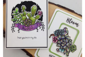
Midweek Creations with Jo Ann: Monochromatic Bouquets
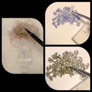
I had decided that I wanted to stamp just the flowers, from the Bouquet of Hope Stamp Set, on today’s project. That would require a lot of masking and careful inking. It would be much easier to color the stamp itself, so I reached for my watercolor markers. I used Marvy LePlume II markers because they are heavily pigmented and work well with water, but Tombow Markers or Distress Markers would work equally as well. Use what you have on hand.
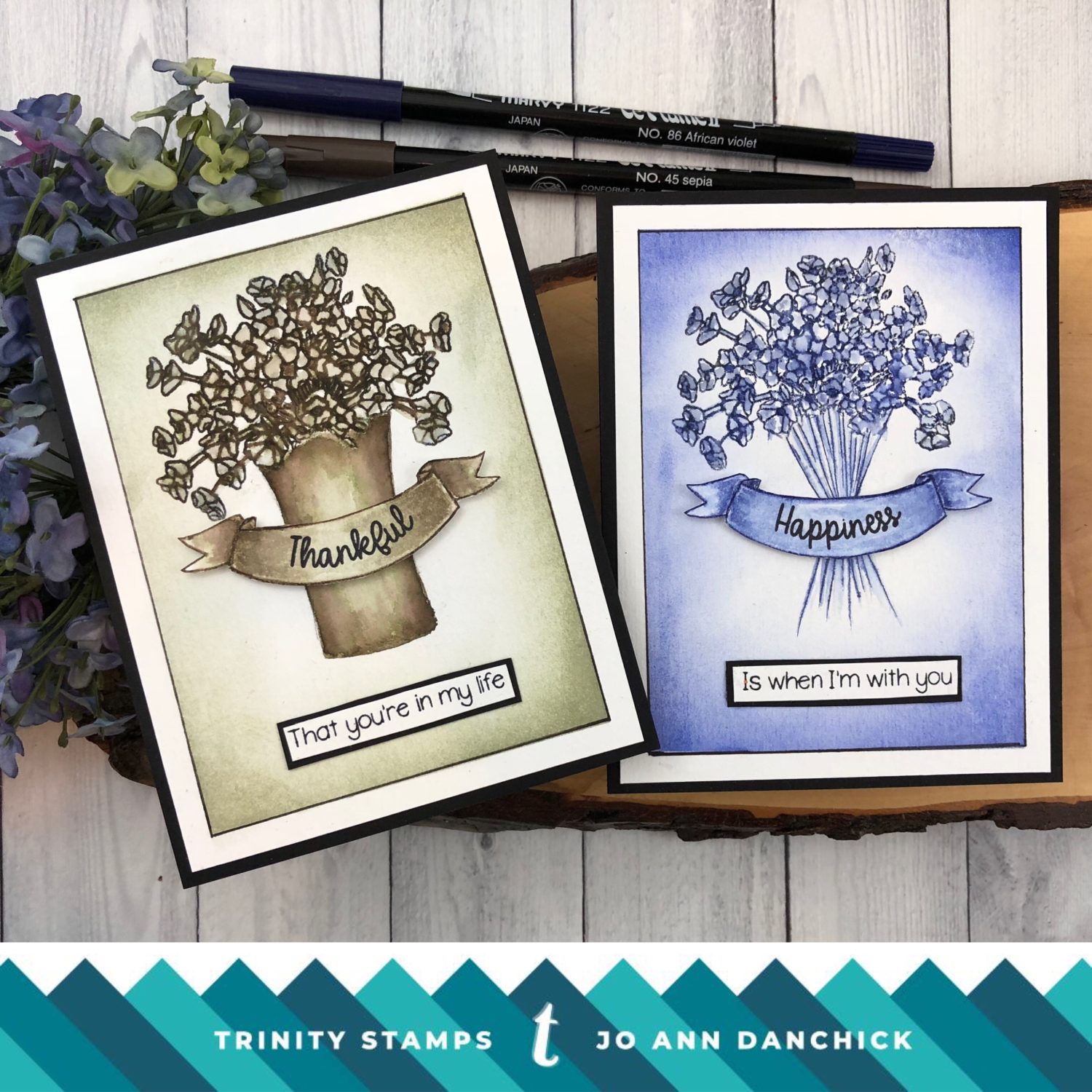
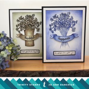
Next, I had to choose which colors to use. The images in the bouquet are small and it would be tedious coloring each bloom on the stamp. I decided to just use one color. Monochromatic creations can be very striking. The tricky part is creating lots of shading so each part stands out. I love the Sepia look but I also love the Delft Blue look…so I tried both. I couldn’t choose which one I liked best so I am sharing both here today. Grab a cuppa and let’s get started.
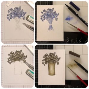
I placed a piece of Tim Holtz Watercolor cardstock in my MISTI. Watercolor paper is textured and it is easier if you use a stamping tool so that you can restamp if needed. I colored the bouquet only, from the Bouquet of Hope Stamp Set, using #86 African Violet. For the second card I used #45 Sepia. Sepia breaks down into the most glorious brownish greens when water is added.
You do not have to hurry at this point. The colors will react with water now or hours later. Because the blooms are small and close together, you will not need much water. I used a #2 Round Connoisseur White Taklon watercolor brush. Pinch most of the water out of the brush and lightly dab at each image. Do not use strokes. This will release the color without flooding the image and losing your outlines. I probably only wet my brush twice for each image. I learned this method years ago from the amazing Bonnie Krebs from Art Impressions.
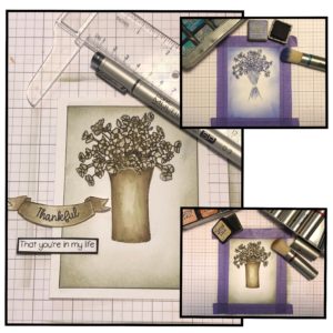
For the sentiment, I selectively inked around the banner from the Succulent Banner Stamp Set. It’s difficult to get totally clean lines but it doesn’t matter since you will be fussy cutting it. The other end of the Marvy LePlume markers has a fine tip so it is easy to fill in the missing lines. The banner was colored using a much wetter brush to spread the ink and fill it in. To add a little more color and shading, I scribbled additional ink onto my glass mat and picked it up with the paintbrush.
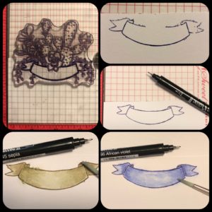
For the African Violet picture I lightly drew in some stems, inked them with the fine tip end, and lightly added water to them. I drew a simple vase for the Sepia picture. I had some stray marks so I used a Mono Tombow sand eraser to get rid of them. I lightly penciled a frame line 1/4” in along the outside edge.
It needed something more. Sometimes the simplest cards take the most thought for me! LOL I taped off the frame and lightly brushed Distress Ink around the edges. Make sure that you hit all the edges with some color. I used Blueprint Sketch for one and Old Paper for the other. The frame line was darkened with a .3 Copic Multiliner. I have been using the refillable set more because the ink and nibs can be replaced when needed.
I stamped a sentiment, from the Succulent Banner Stamp Set, onto each banner using Ranger Black Archival Ink. An additional sentiment was stamped onto a piece of cardstock and then backed with black cardstock.
To finish the cards I added Scotch Foam Tape to the back of the sentiments for added dimension. The panels were mounted to a piece of black cardstock and then onto a #110 Neenah Cardstock cardbase, using a Kokuyo Tape Runner.
Using one color only is both easy and hard. It takes the guess work out of which colors to choose but it also requires making sure that you have added depth with shading. The end results are both elegant and classy. Give it a try.
Thanks for joining me today. I look forward to creating with you again here with Trinity!
Joyfully, Jo Ann
Supplies used:
The products that I used are listed below in compensated affiliate links. You can click the icon of your choice, below the product picture, to go directly to your favorite shop. There is NO additional cost to you when using these links. Thank you for your support!